Cool, Calm, Collected: Blue-Toned Interiors
Our homes are working harder than ever. They’re offices, social spaces and places to switch off – often all in the same day. It’s no surprise then that interior trends are moving towards creating environments that feel quieter and more composed. Cool blue interiors meet this need beautifully, combining softness, light and simplicity to create spaces that feel naturally calm. In today’s blog we’ll explore how you can bring that same sense of clarity into your own home.
Clean lines and smooth finishes
Colour sets the tone, but it’s the styling that defines the overall feel. Cool-toned interiors lean into clean lines and simplicity, creating spaces that feel structured without being rigid.
Furniture in these spaces is kept simple and streamlined, with low-profile sofas, clean-lined cabinetry and minimal detailing. Every piece is chosen with intention, focusing on quality and function rather than ornament or excess.
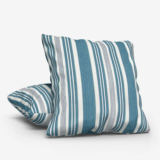
Fabrics follow a similar direction. Linen, cotton and lightly textured weaves add softness without overwhelming the space. Patterns, if used at all, are understated – fine stripes, tonal variations or barely noticeable geometric designs.
Texture becomes especially important in keeping the look from feeling flat. Matte finishes, brushed metals, smooth ceramics and natural stone surfaces introduce variation while staying within the restrained palette. These details catch the light in different ways, adding quiet interest without disrupting the overall calm.
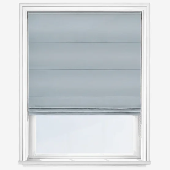
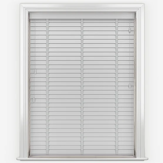
Windows and light control
In a theme built around light and tone, window dressings play a central role. They’re not just there for privacy, they actively shape how the space looks and feels throughout the day.
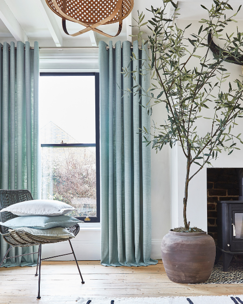
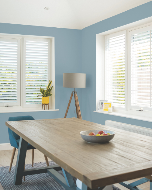
Sleek roller blinds are a natural fit for this aesthetic. Their simple, streamlined design sits neatly within clean-lined interiors, allowing the focus to remain on the overall space rather than the window itself. Choosing made to measure options ensures a precise fit, reinforcing that sense of order and polish.
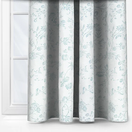
Colour choice is equally important. Soft grey or muted blue blinds can blend seamlessly into the palette, while crisp white options help maximise brightness. For a layered look, combining blinds with sheer curtains can introduce an extra level of softness without adding visual weight.
Light-filtering fabrics are particularly effective here. They diffuse incoming daylight, reducing glare while maintaining a gentle, consistent glow. This is especially useful in living areas where you want to keep the room bright but comfortable, or in spaces with large windows that receive strong direct sunlight.
Designing for calm
Rather than relying on bold statements or high contrast, this trend focuses on balance. Soft blues, pale greys and crisp neutrals naturally evoke open skies, water and stone; elements we instinctively associate with calm and stability.
This approach isn’t about stripping a space back to the point of emptiness. Instead, it’s about removing visual noise. When colours feel harmonious and layouts are considered, rooms become easier to navigate and more comfortable to spend time in. The overall effect is a home that feels organised, light-filled and quietly restorative.
The cool colour palette
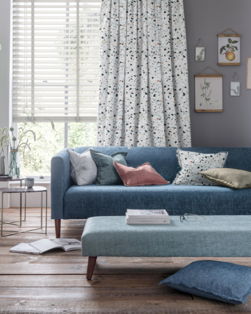
The success of this trend lies in how the palette is built. Rather than relying on a single shade, these interiors layer tones that sit closely together, creating depth without disrupting the calm.
Soft blues are often the starting point. From barely-there powder tones to slightly deeper slate hues, blue brings a sense of serenity while still feeling fresh and contemporary. It pairs effortlessly with pale greys, which add structure without heaviness, and cool whites that keep the scheme feeling clean and open.
Muted stone tones, like chalk and soft taupe, help ground the palette, preventing it from feeling too crisp. These warmer neutrals introduce just enough softness to keep the overall look inviting.
One of the key advantages of this colour story is how it interacts with light. Cool tones tend to reflect daylight gently, creating an even brightness across the room. In spaces with strong natural light, they help soften intensity; in north-facing rooms, they enhance what light is available without making the space feel dull.
Creating atmosphere through light
If colour sets the foundation, light is what brings a cool-toned interior to life. The aim isn’t dramatic contrast or sharp shadows, but a softer, more even distribution that supports the overall sense of calm.
Diffused daylight is key. When light is filtered gently into a room, it reduces harsh highlights and creates a more balanced environment. Surfaces appear smoother, colours feel more cohesive and the space as a whole becomes easier on the eye.
Shadows still play a role but are subtle, providing soft edges rather than strong lines. This adds depth without introducing visual tension. Throughout the day, the way light shifts across walls, floors and fabrics creates quiet variation, keeping the space from feeling static.
Artificial lighting should follow the same principle. Layered sources, such as table lamps and discreet ceiling fixtures, help maintain an ambient glow in the evening. Cooler white bulbs can complement the palette, but it’s important to keep the overall effect warm enough to feel inviting.
A space to breathe
Cool blue interiors are more than a passing trend – they reflect a broader move towards thoughtful, liveable design. By combining a restrained palette, clean-lined styling and carefully controlled light, these spaces offer a sense of calm that feels both modern and enduring.
It’s an approach that works quietly in the background, supporting everyday life without demanding attention. The colours feel fresh, the layout feels clear, and the atmosphere remains consistent from morning through to evening.
The result is a home that feels composed and comfortable, where everything has its place, and where you can step away from the noise of the day and simply breathe.
To help you bring this look into your own home, we’ve shared some of our favourite pieces below, along with a curated collection that captures the mood beautifully. Explore our Cool Blue Edit collection to discover effortless window styles, smooth finishes and calming tones inspired by this trend. If you’re unsure which finish suits your decor, you can order up to eight free samples from the website.
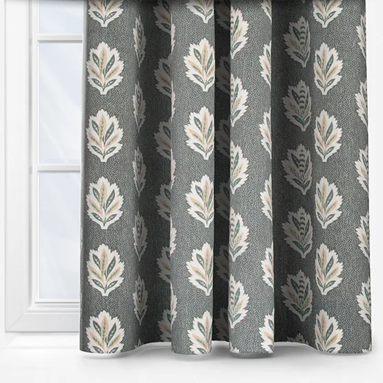
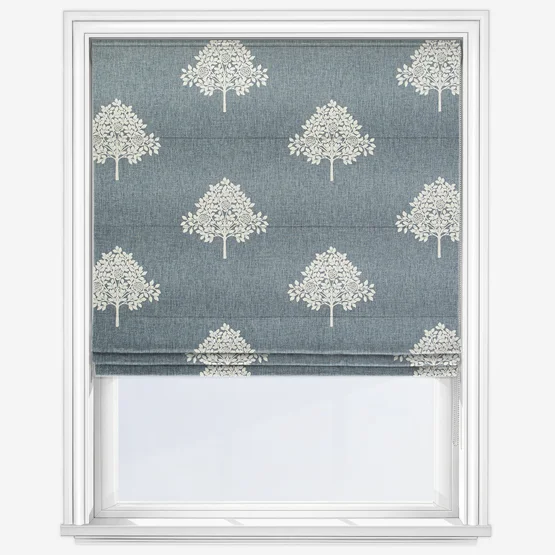
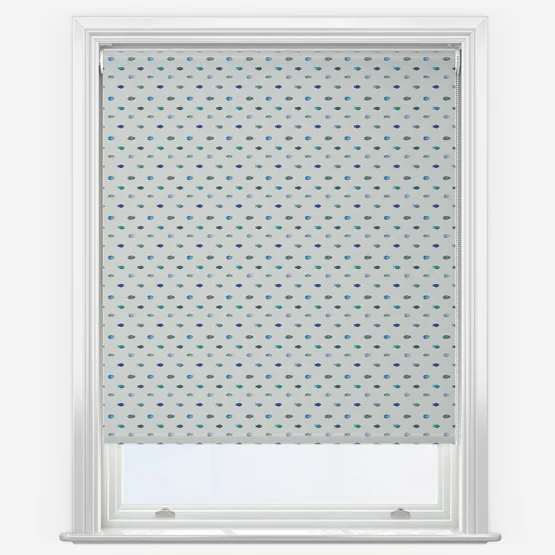
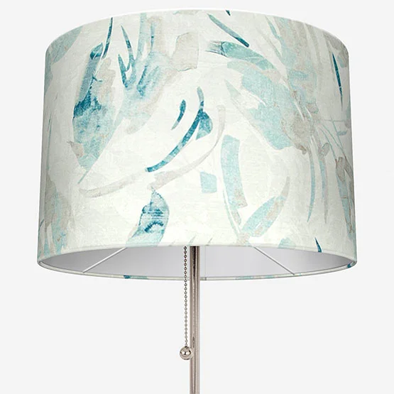
Shop our favourite products for cool blue interiors
Other posts you may be interested in:
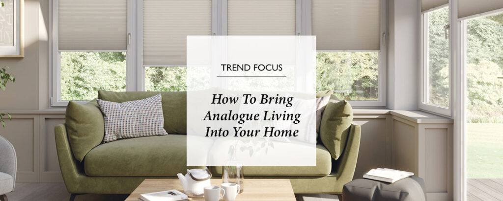
How To Bring Analogue Living Into Your Home
Over the last few months, a quiet shift has emerged: people are rediscovering the joy of real, physical media and entertainment, stepping back from doom-scrolling and endless hours of screen time. It’s part of a broader desire to “go analogue” – and that shift is now shaping the way we design our homes.
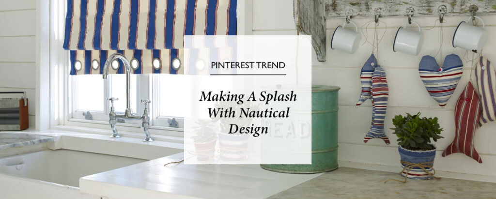
Making A Splash With Nautical Design
Step aboard a world where the spirit of the sea meets the comfort of home. Inspired by the breezy charm of coastal living, this style blends maritime motifs with effortless sophistication. Whether you’re dreaming of a beachside retreat or simply craving a breath of ocean air, the Nautical trend offers a relaxed, refined way to bring the coast to you.
Browse Our Buyers Guides
Our collection of window furnishings and homeware is defined by quality and craftsmanship. We’re confident we can provide you with the perfect product for your home, no matter your requirements. From moisture proof and stain resistant blinds for bathrooms, to blackout blinds and personalised pieces for kids’ rooms…
Share this post
Other posts you may be interested in
Interior Design Trends 2021
By Ana Zuravliova
Celebrating Bugs, Birds, And Beasts in Interior Design
By Ana Zuravliova
Interior Design Trends 2021