


Colour Focus: Ponder
By Amy Kilvington
One of Pantone’s favourite colour combinations of 2020, Ponder is a dreamy palette of cool blues and soft shades. Bringing calmness and a feeling of tranquility, Ponder is a soothing colour palette that’s good for the spirit, as well as being a beautiful choice for your home.
About the Ponder colour palette
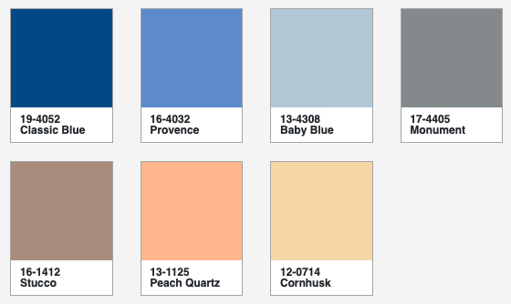
Sitting at the start of Ponder is Classic Blue, Pantone’s colour of 2020. This shade of blue is truly timeless, selected for its strength, stability and enduring style. It is a tone that helps us concentrate, as well as bringing a feeling of balance to both our minds and our environments. Pantone has described Classic Blue as a universal favourite that is easily relatable and honest, two characteristics that we crave in the modern world (for more information about Classic Blue, visit our blog post).
Alongside Classic Blue comes two more shades of blue: Provence and Baby Blue. Both are reminders of the sea and the sky, offering a feeling of openness, opportunity and depth. While Provence can be likened to cornflowers, forget-me-nots and the charming shutters that adorn windows in rural southeastern France, Baby Blue brings a soft, daydreaming mistiness to the palette.
Sitting opposite Ponder’s blues are Peach Quartz and Cornhusk. These soothing tones work in harmony with the cooler corners of the palette, making it feel brighter and more dynamic. Peach Quartz is a warm, blushing, almost saturated colour, while Cornhusk has subdued yellowy undertones.
All are grounded by Monument and Stucco, shades of strong grey and light brown, respectively.
How to use Ponder in your home
There are a number of ways to bring Ponder into your home. This colour palette draws inspiration from both the mid-century and pastel colour trend, so it lends to a variety of interior tastes, whether you prefer retro, Scandi or countryside styles.
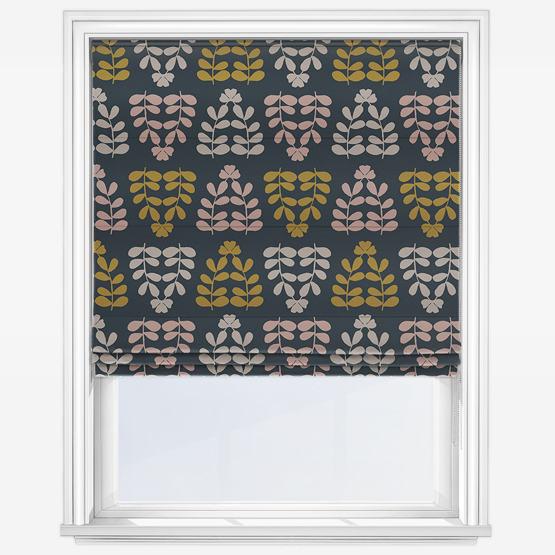
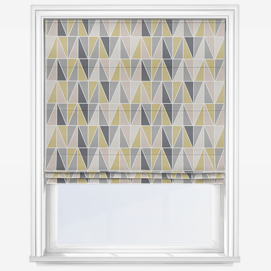
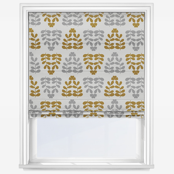
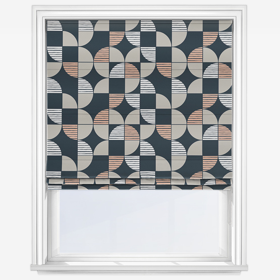
For the mid-century fanatic, Ponder will pair perfectly with your retro styling and natural woods. Consider a bold pattern repeat cushion or throw in peach and grey set on blue, or yellowy-peach and blue on white. This look also works for maximalist interiors, creating depth and drama in the space. Mix with dark walls and eclectic pieces to make a real statement.
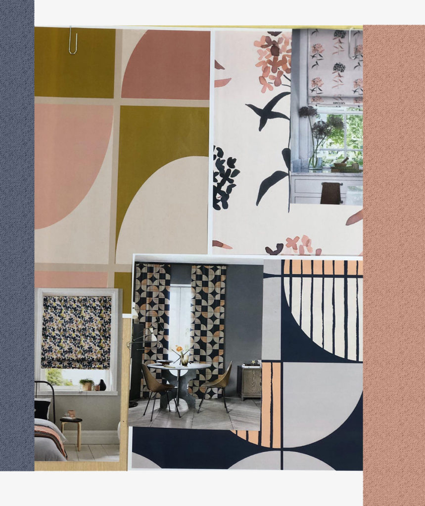
For a more luxurious feeling, go heavy on Classic Blue and Peach Quartz, teaming with softer accents of grey and white. Try blending these colours with brushed velvets and metallics to create an Art Deco-inspired space.
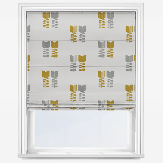
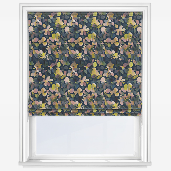
For Scandinavian-inspired interiors, accents of Ponder’s yellowy-peach, blue and grey work well upon crisp white backdrops. Meanwhile, homeowners with traditional tastes can create a country feeling with florals in shades of blue and peach. Look out for these prints in cottons and linens, bringing a fresh airiness to the space.
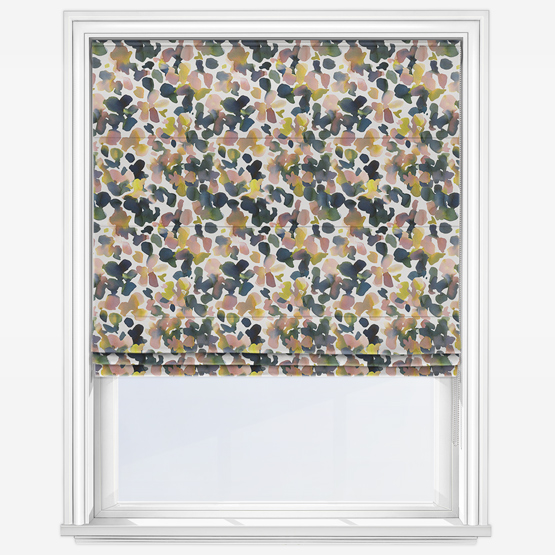
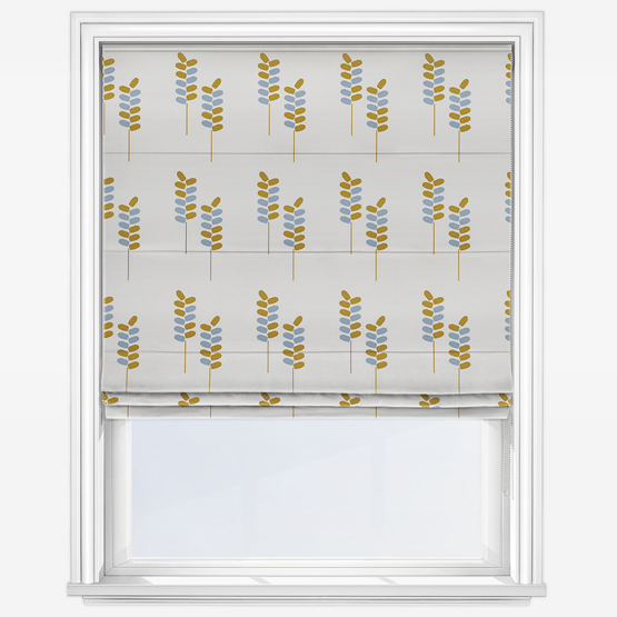
Shop our designs
Take a look at our latest designs in a Ponder-inspired colour palette. Which is your favourite? Click the image to shop direct or see our full range at Blinds Direct.
Embrace Pantone’s Ponder palette and make more of your space with high quality made to measure blinds, curtains, cushions and lamp shades from Blinds Direct. Want to know more about the latest styles and trending colours? Get in touch with our team for more information.