


Spring/Summer 2025: How to Bring Pantone’s Hottest Colours into Your Home
In recent months, we took a close look at Mocha Mousse, the Pantone Colour of the Year for 2025, but this isn’t the only colour Pantone has noticed for this year. In this blog, we’ll be taking a look at the remarkable shades in Pantone’s Fashion Colour Trend Report Spring / Summer 2025 and how you can use them to find inspiration for your own home!
Using Pantone for inspiration
Pantone’s Spring / Summer 2025 colours are brimming with potential. With ten diverse and dynamic shades, there is inspiration here for any interior design style, from contemporary maximalist to soothing neutrals. While each colour is beyond beautiful, it can be hard to find home furnishings in these exact shades so to help, we’ve collated ten room scenes featuring related shades which might just help you on your home decor journey.
Add depth and warmth with rich browns
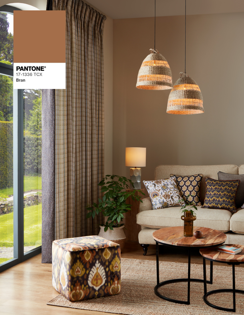
Pantone’s first spring summer colour is a beautiful rich, earthy brown tone. Bran is a tasteful, comforting shade ideally suited to warm cream shades and off whites. Moreover, you could even pair shades similar to Bran, with darker browns for a fashionable colour drenched aesthetic.
Embrace the beauty of soft purple and lilacs
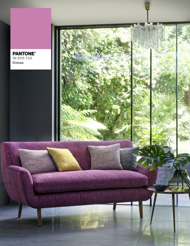
Crocus is the perfect colour for a youthful spring refresh. Delightful, soft purple and lilacs will add an impactful statement to your home while also curating a cosy ambience. While bold and beautiful, shades like this will also synergise with an array of colours including brilliant whites but also blues and yellows.
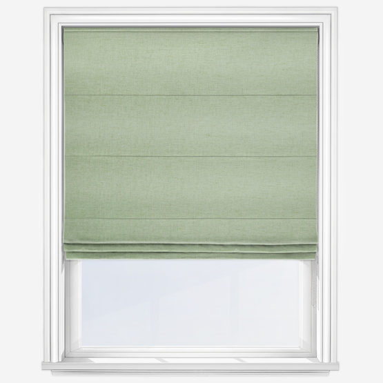
Enjoy lively light limes
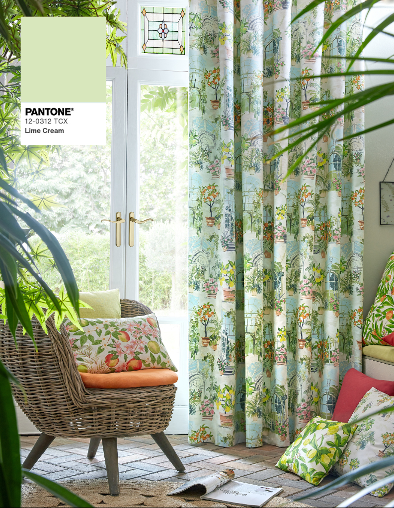
Lime Cream is a fabulous colour as both the leading tone or as a supporting shade. All creamy shades of green offer an organic energy to a space making it both cosy and mindful. For the best results, combining creamy green tones with other shades of green, browns or even dusky pinks will make a strong style statement in any room.
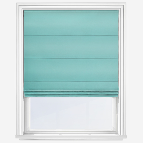
Relax with soft cyans
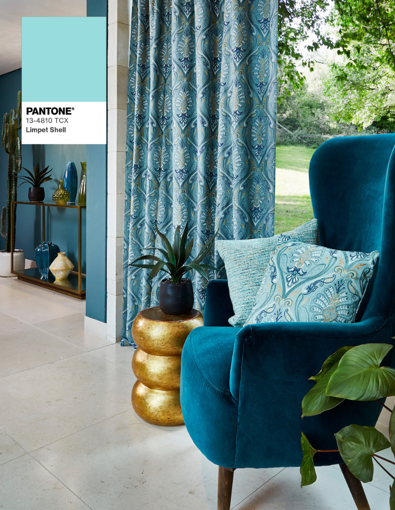
Fourth on the list is the energising, refreshing Limpet Shell. Full of vitality, this lovely shade showcases the power of soft blue green. Bright, more electric, greener shades of blue have become popular in the recent past, and this popularity shows no signs of abatement. Combine with white or green for a more coastal inspired finish.
Energise with bright greens
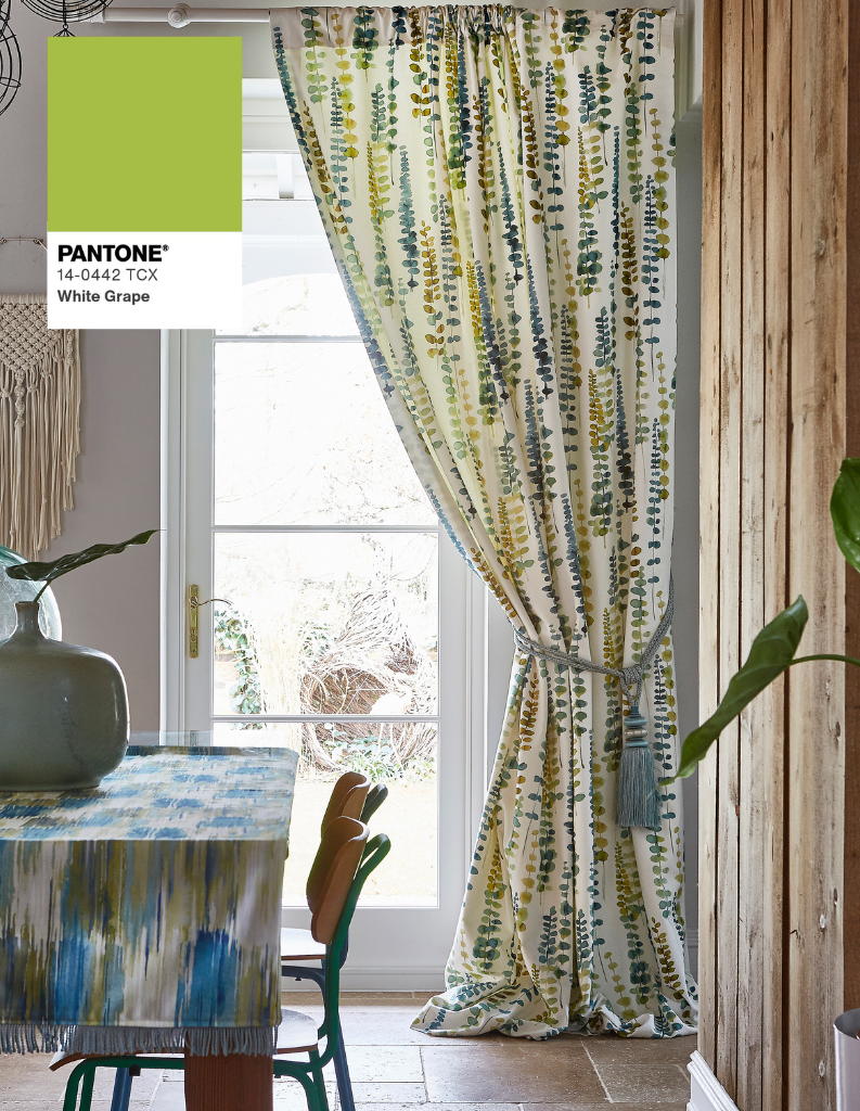
Green shades remain very popular in interior design, and White Grape offers the perfect balance between vibrancy and organic authenticity. Bright, natural shades of green are ideal for many rooms including bedrooms, living rooms and even home offices. They’re best introduced using Roman blinds or curtains.
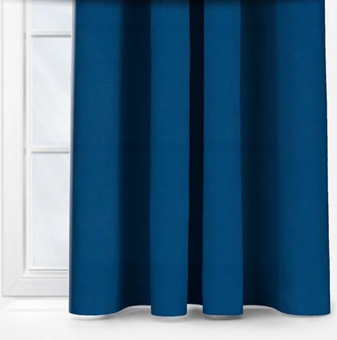
Go bold with royal blues
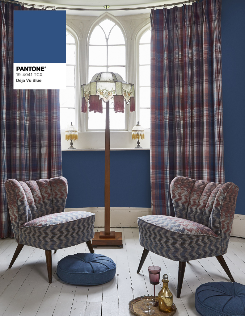
Deja Vu Blue demonstrates how shades of royal blue can be. Adding the perfect balance between traditional charm and contemporary style, shades of royal blue will perfectly elevate any home’s appeal. Moreover, you can enjoy a coastal aesthetic when mixed with white, or some bohemian with the right patterns.
Harness nature with leafy greens
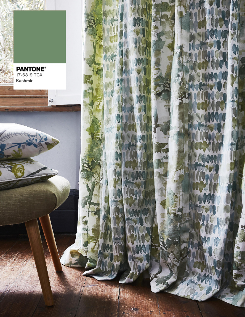
Offering the pinnacle of natural beauty, Kashmir is a deep leafy shade of green that’s the perfect partner for rooms with plenty of light, real wood. Rooms with wooden Venetian blinds or shutters benefit from shades of green similar to this. Introduce these colours easily with cushions and lamp shades.
Go for gold with bold yellows
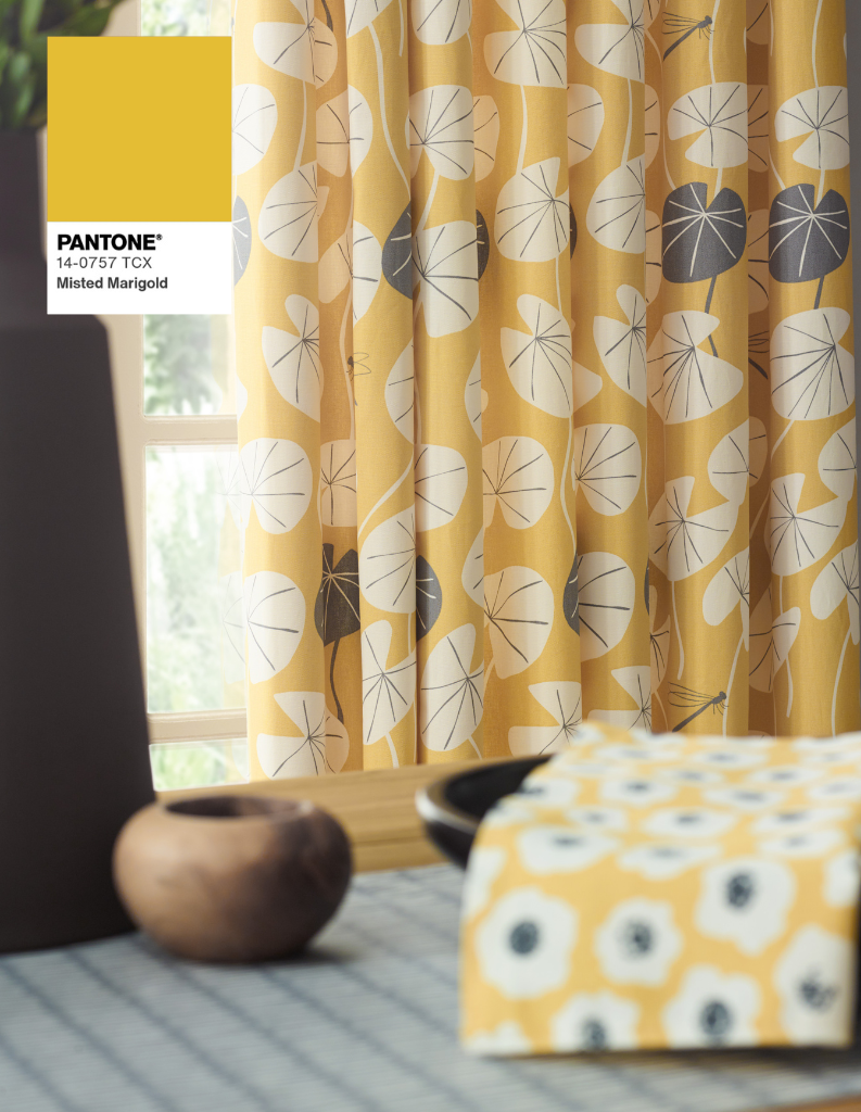
The first and only yellow shade in Pantone’s list is joyful Misted Marigold. Golden shades of yellow are one of the best ways to brighten a room, adding energy and vitality to its appearance. Whether you combine it with white, pink, blue or orange, golden yellows are easier to enjoy than you might expect.
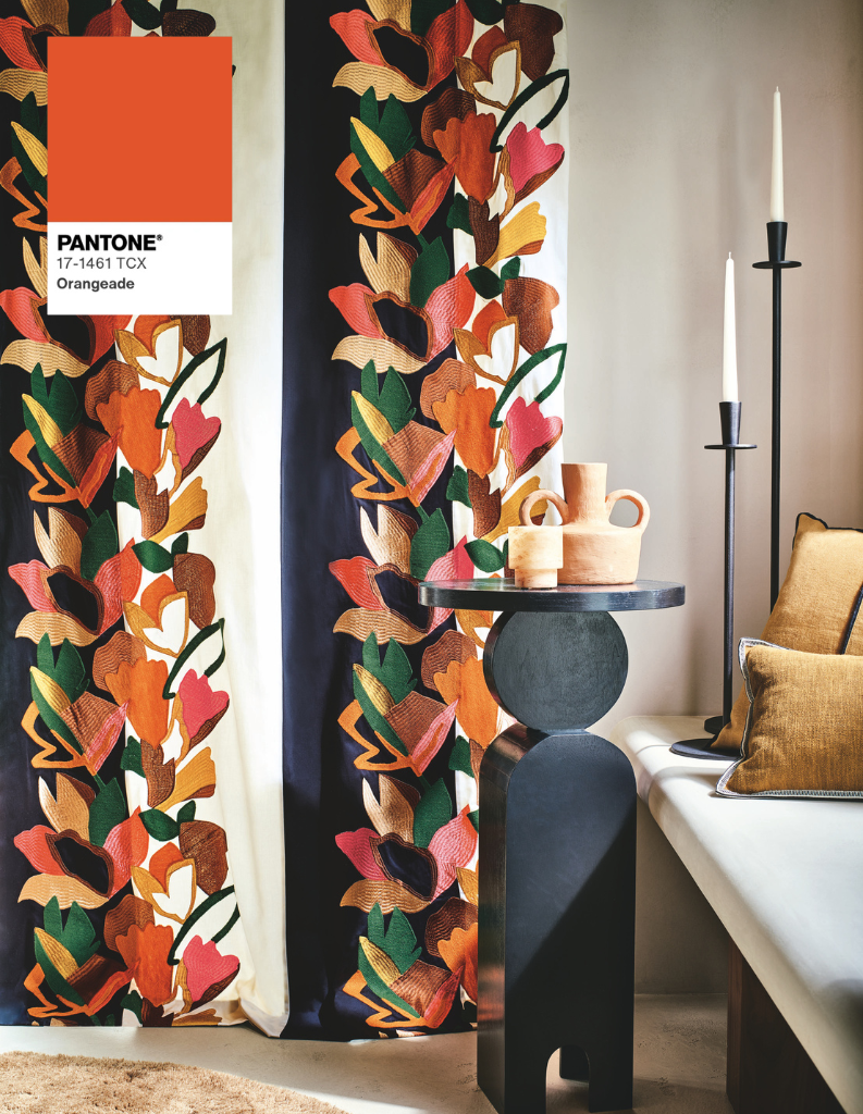
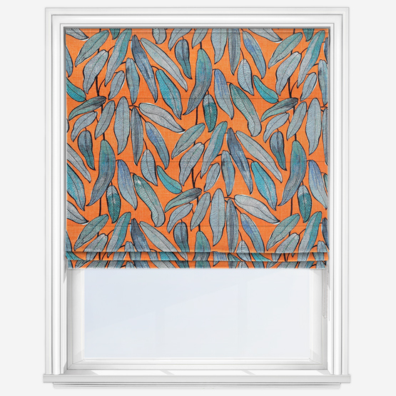
Add a splash of vibrant orange
Unsurprisingly, Orangeade is an exciting shade of orange. Rich, warming and versatile, this shade borders terracotta, featuring a natural, comforting spirit. The benefits of orange shades are often overlooked, but you can learn just how beautiful they can be in our Colour Focus: Shades of Orange blog.
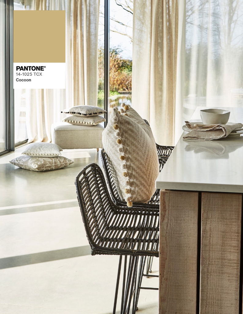
Find peace and harmony with taupe
Last, but by no means least, is Cocoon, a homely, sandy taupe colour. Shades similar to this are perfect for the more modern neutral shades that have replaced white and cold grey with warm creams, oatmeals and taupes. Synergising beautifully with a wide selection of other warm neutrals, these are ideal choices for Roman blinds and curtains.
Each of these ten colours offers a great amount of inspiration for all interior design styles. While fantastic starting points however, you don’t need to obsess over finding the exact shade. To ensure you find the perfect colours for your home, be sure to explore Instagram and Pinterest, and don’t forget, you can order up to eight free samples from the website to see your options in the flesh.
Shop our favourite products complementing the Pantone palette
Other posts you may be interested in:
Pantone’s Colour Of The Year 2025 – Mocha Mousse
Each year, Pantone announces its colour of the year, and this year’s winner is very special. Warming, joyful and supremely flavourful, Mocha Mousse is set to take 2025 by storm. In this blog we take a close look at the refined yet unpretentious, cosy colour and showcase the design options it offers for your home!
What Is Colour Blocking, And Why Is It So Popular?
Colour blocking is the process of using two or more bold and daring colours to create a space fizzing with energy and drama. Originally made popular in kitchens, colour blocking can be used throughout the home and in this blog, we’ll be providing you with our top tips for using this simple yet effective way of decorating your home!
Browse our buyers guides
Our collection of window furnishings and homeware is defined by quality and craftsmanship. We’re confident we can provide you with the perfect product for your home, no matter your requirements. From moisture proof and stain resistant blinds for bathrooms, to blackout blinds and personalised pieces for kids’ rooms…