A Social Snapshot: The Favourites From June
By Ana Zuravliova
We’re back once again with our favourite selection of tagged images from Instagram this month! With so many styles and spaces to consider, we’ve managed to wrestle the selection down to our favourite five! Sit back, relax, and enjoy what we love about each interior look, and how they have revolutionised their spaces! Let’s get started…
Five favourites of the month
As always, narrowing down to these five images was a tough decision to make as we have been tagged in a vast number of striking images. From bold and bodacious décor to minimalistic design, there are hardly any styles we don’t see enriching handmade products.
The five we have selected this month include a beautiful collection of bedrooms, dressing rooms and nurseries. We hope you enjoy the different looks and feel inspired by the masters behind the interiors!
Snuggling down for the night
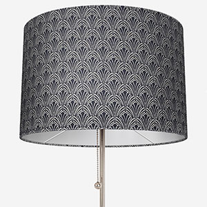
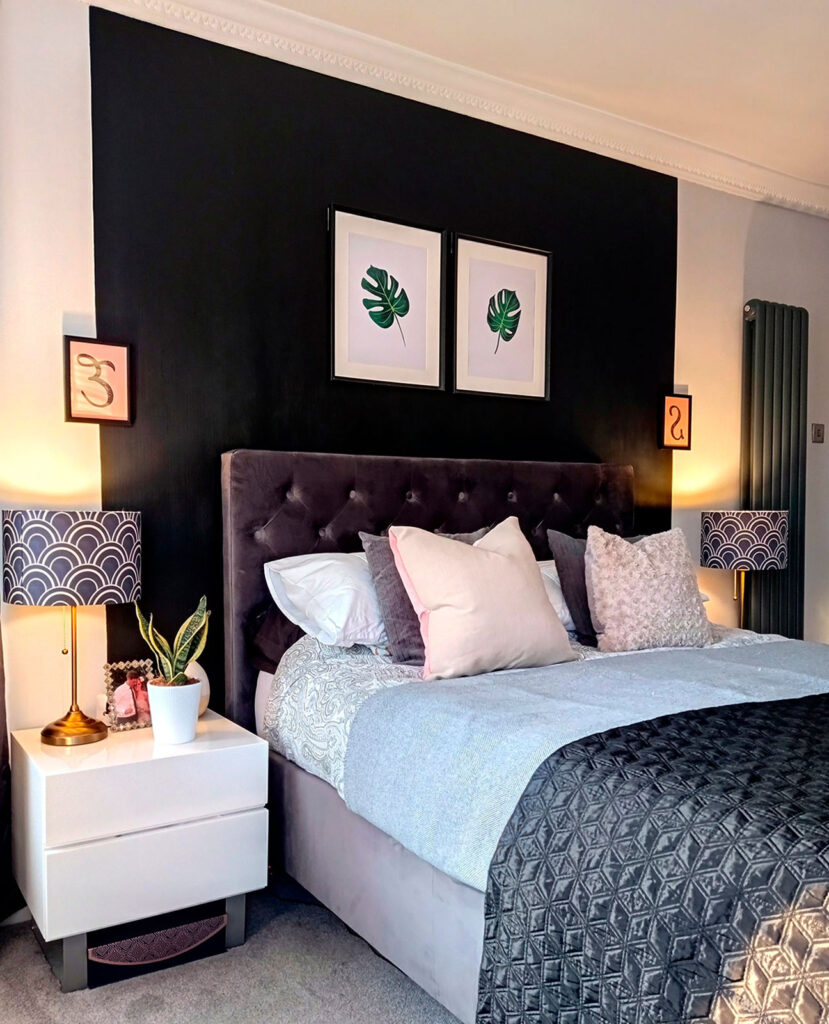
Let’s kickstart this month’s social snapshot blog with this beautiful, characterful bedroom designed by @victorianhouse1896. What we found captivating about this bedroom was the use of various textures, patterns and shades. As we always say, cushions are a great way to change the dynamic within a space and @victorianhouse1896 has created a bedspread of varying textures and colour combinations – we just adore it!
In addition to the beautiful bedspread, an attention to detail that many people tend to leave till the end when designing a space is the lighting and the fixtures they use. The classic bedside table lamps we can see in this décor are completed with eye-catching scalloped pattern lampshades. The pops of pattern introduced by the lampshades help draw your eye toward the bed, which should always be the main focal point within a bedroom. Having subtle indications of pattern within a space brings in character and a sense of your unique style. Despite the challenges offered by alternating patterns, @victorianhouse1896 has executed the pattern play in the most captivating of ways.
Natural nurseries
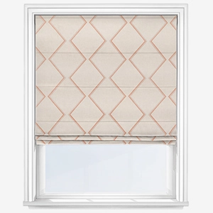
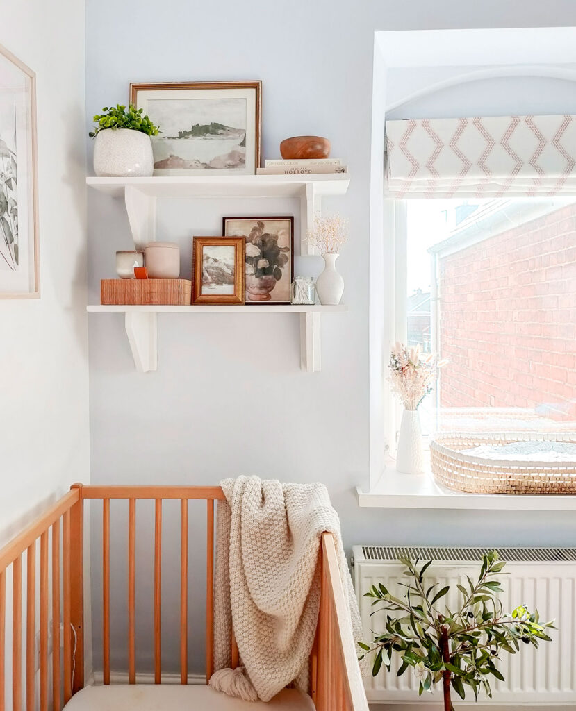
Nurseries are a space in the home that can often raise design questions. ‘Do we go with soft tones to calm the baby, or monochrome patterns to stimulate their creativity?’ The questions can go on, however it is our recommendation to create a space where you and your little one feel relaxed and content when spending a large volume of time there.
This is one thing we particularly love within this nursery design by @thestylepad_uk as it portrays a space of relaxation and contentment. The uncomplicated colour on the walls makes a good foundation from which to add in texture and touches of colour which we can see through the use of the olive tree and plants on the shelves and windowsill. The geometric Roman blind brings in pattern without being domineering in this calming room. The use of simple, soft patterns within a nursery are great for stimulating the creative part of a baby’s brain, and the natural elements brought in through the wicker basket and wooden cot add a warming touch to the space, making it one worthy of spending large lengths of time in.
Gentle tones with a glamorous touch
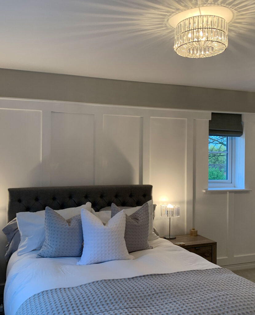
Panelling, soft grey tones, and elegant lighting – what’s not to love about this bedroom designed by @allabouttheandersons?
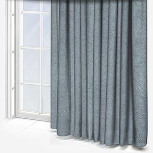
Panelling and grey shades are all the rage at the moment. With panelling bringing in insulating properties to homes and grey being a shade that complements any interior scheme, this bedroom is bang on trend! One aspect we particularly love about this space is the use of the glass light fittings. They bring in a glamorous touch to the room which reflects the light in the most elegant of ways.
Throughout the room we can see three shades of grey, the warm shade on the walls, the lighter tone on the bedding and the deep shade within the grey roman blind and headboard. Sticking to the same colour and using a range of shades is a great way for creating a space full of character and depth. With the white panelling contrasting against the grey tones, this space is modern and refreshing yet the use of the darker shades makes the room relaxing, ideal for settling down for the night!
A pop of colour
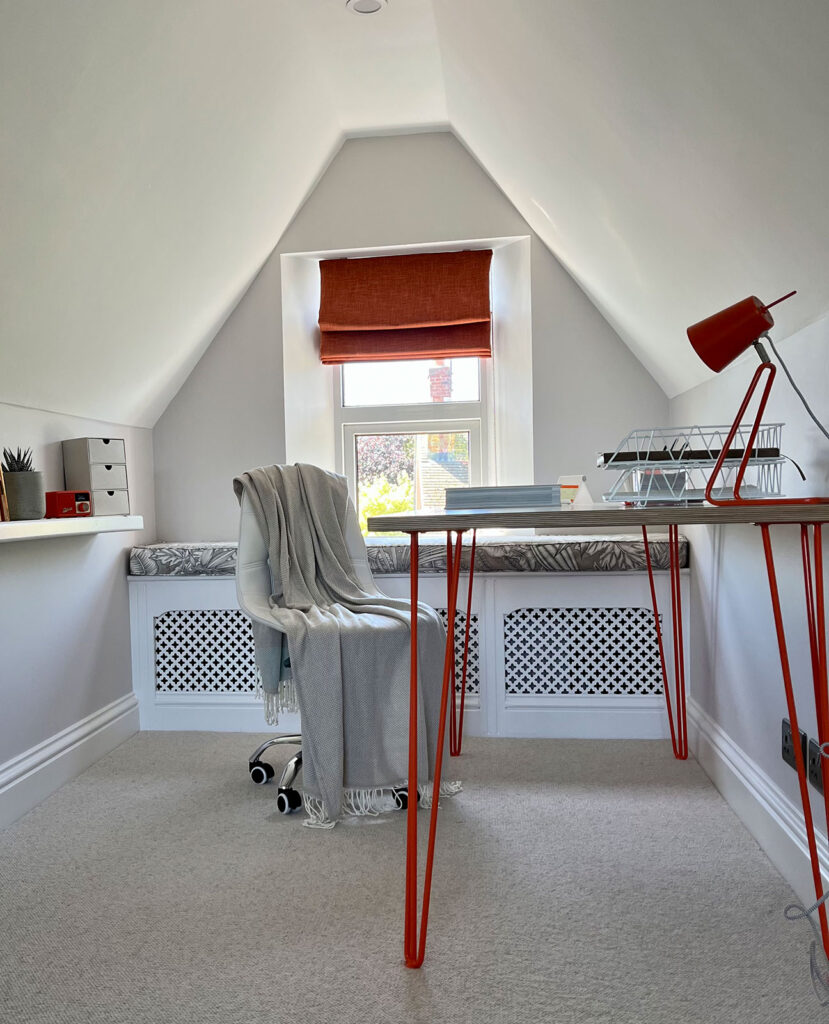
Looking to transform your space without the hassle and expense of massive redecoration? Look no further for inspiration than @wolfduckmouse. Sticking with a simplistic colour palette allows for implementations of pattern and colour to come through via soft furnishings and styling items. Throughout @wolfduckmouse’s décor, the use of dark orange has been used in the roman blind, desk lamp and table legs, and we just adore the dynamism of this shade. It instantly makes the space eye-catching and captivating, and we would definitely like to work from home all day there.
The beneficial factor of using pops of colour through styling items means that when you want to have a refresh of the space you don’t have to go back to the drawing board and rethink the entire décor of the space. Simply swap out the colour that you no longer want in the space and replace it with a new one. Scatterings of soft furnishings and home accessories, such as lampshades and cushions are a great starting point for bringing in new colours and patterns to a room. We think @wolfduckmouse has done a fabulous job at creating a space that can be easily updatable while remaining stylish and exciting!
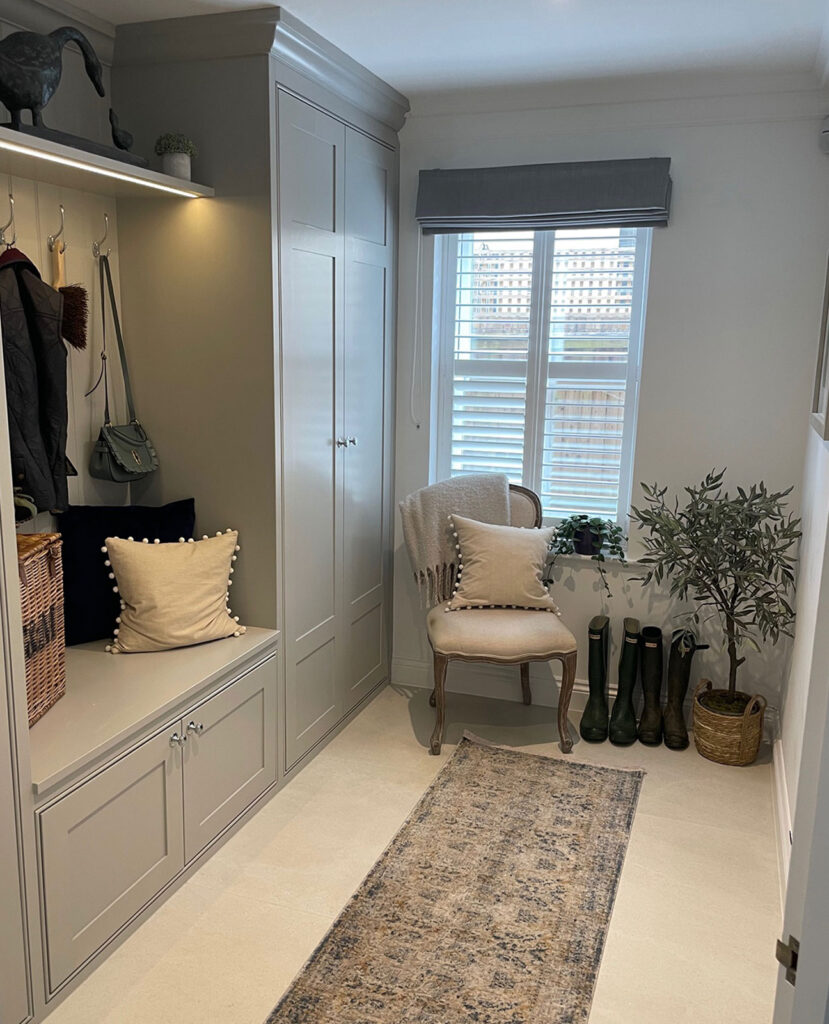
Stylish boots…
Who doesn’t love to be on trend and stylish with both their personal look and interior design?
We know we do, and by the looks of things so does @life_in_surburbia with their elegant boot room. Boot rooms can often become the ‘dumping ground’ for muddy belongings and a space in the home that is often neglected. However, @life_in_surburbia has a boot room that is so pristine we wouldn’t even consider trapping a spot of mud into the space!
Now, let’s get into what caught our eye with this sophisticated boot room… The soft green-grey shade used in the bespoke unit brings a contemporary country look to the space – think classic English countryside decor with implementations of modern touches, like the shutters per say.
A design trend that we currently adore and can see in the boot room is layering. The combination of shutters and roman blind add texture and a modern touch to the room. The horizontal slats of the shutters modernise the space transforming the classic country style colour palette into a contemporary feeling space. Layering with the roman blind helps soften the feel within this boot room, adding a stylish, homely flare to the room.
Every month we get tagged in spectacular designs and refining down to our top picks from the month is always a fun challenge to face. We love seeing the diverse décor of everyone’s unique styles. If you have purchased any products from Blinds Direct, be sure to tag us on Instagram with our handle –@blindsdirectgb, to be in with a chance of featuring in our next blog!
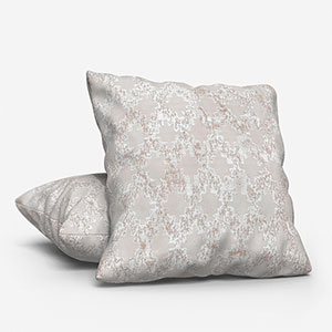
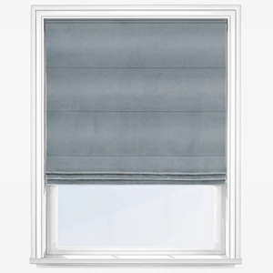
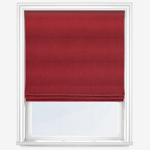
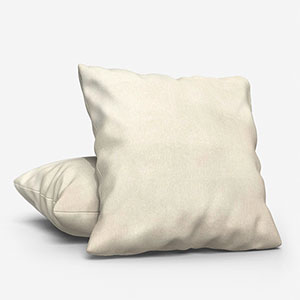
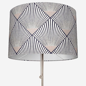
Shop some of our favourite products featured in, and inspired by these posts: