The Unexpected Balance Of Blue And Brick Red
Among the many colour combinations emerging in modern interiors, blue and brick red stand out as an emerging pair that exudes both confidence and charm. This duo combines soothing calm with earthy warmth, offering a rich palette that feels as grounded as it does dynamic. In this blog, we’ll dive into the timeless appeal of blue and brick red, showing you just how transformative and balanced this pairing can be.
Start with your hero hue
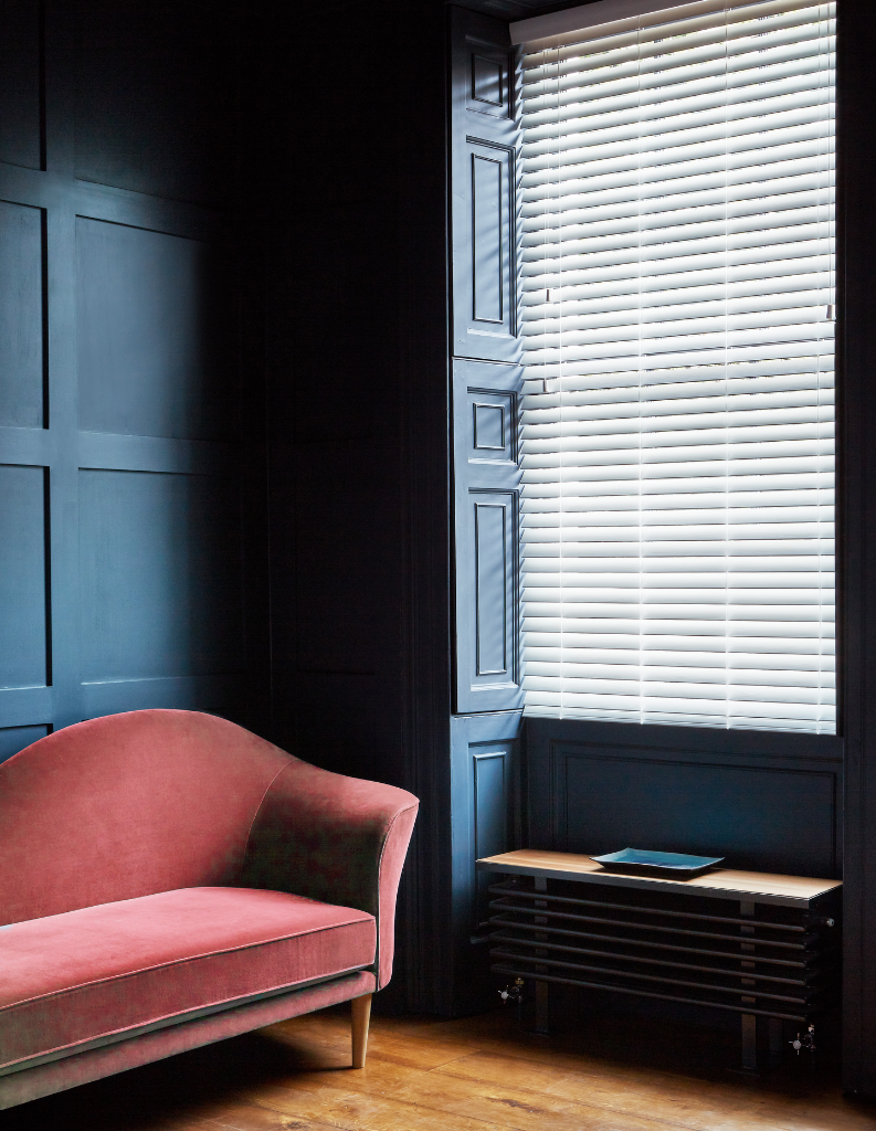
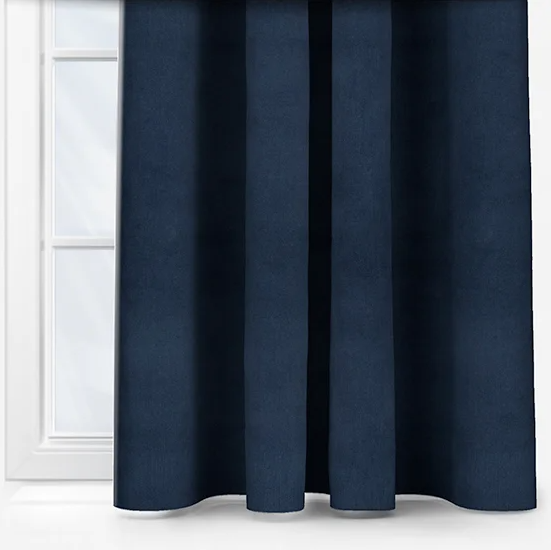
Decide early which colour will play the lead role. A navy or slate blue backdrop (walls, upholstery, or cabinetry) allows brick red to pop as a vibrant accent without overwhelming the space. Prefer the richness of red? Use brick red as the anchor – through a painted wall or statement piece – and bring in blue elements to create contrast and calm.
Explore tonal variations
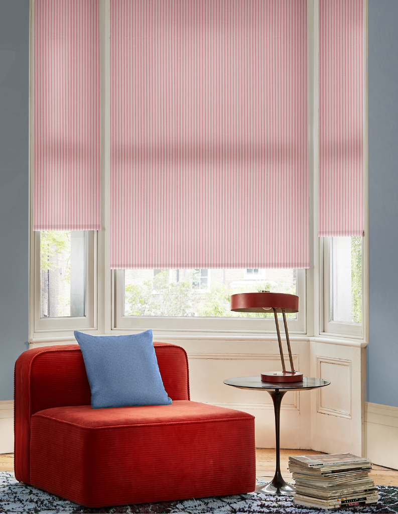
Not all blues and brick reds are created equal. Mix deep navy with rusty reds for a moody, dramatic palette, or combine softer, dustier blues with faded terracotta tones for a more relaxed and sun-washed feel. Staying within a similar saturation level keeps the look cohesive while still feeling dynamic.
Use colour blocking with confidence
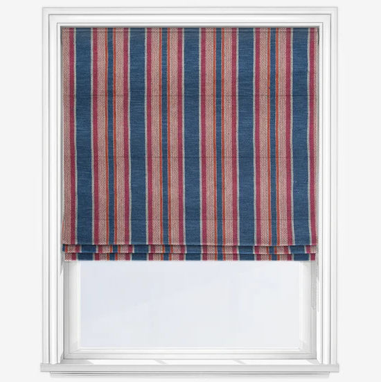
This pairing lends itself beautifully to bold colour blocking. Think a brick red headboard set against a painted blue wall, or bold curtains set against a contrasting Roman blind. These moments of direct contrast can create powerful visual focal points, especially in contemporary or eclectic interiors.
Let the colours breathe
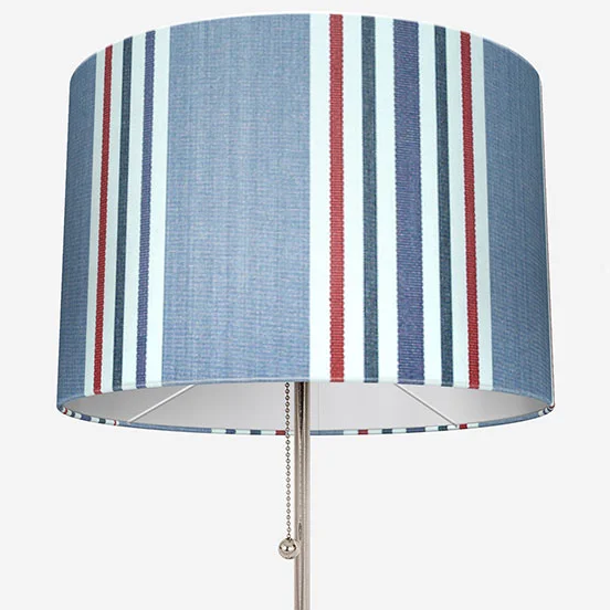
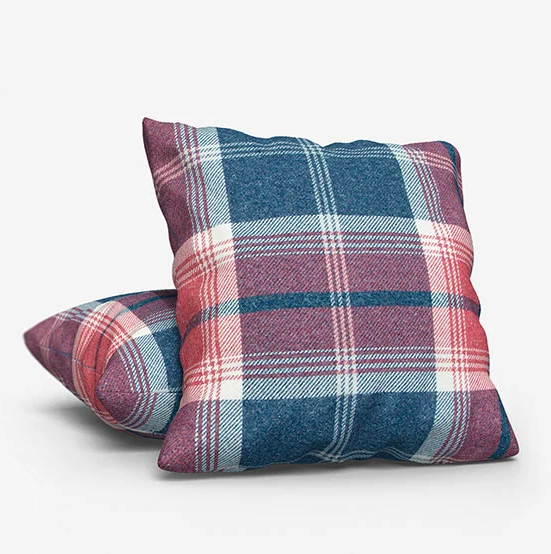
Rather than using blue and brick red just once each, repeat both hues in small ways throughout the space. A blue rug with subtle red threading, a decorative lamp shade with both tones, or even patterned cushions that weave them together can make the scheme feel layered and intentional.
Blue – calm, tranquil and introspective
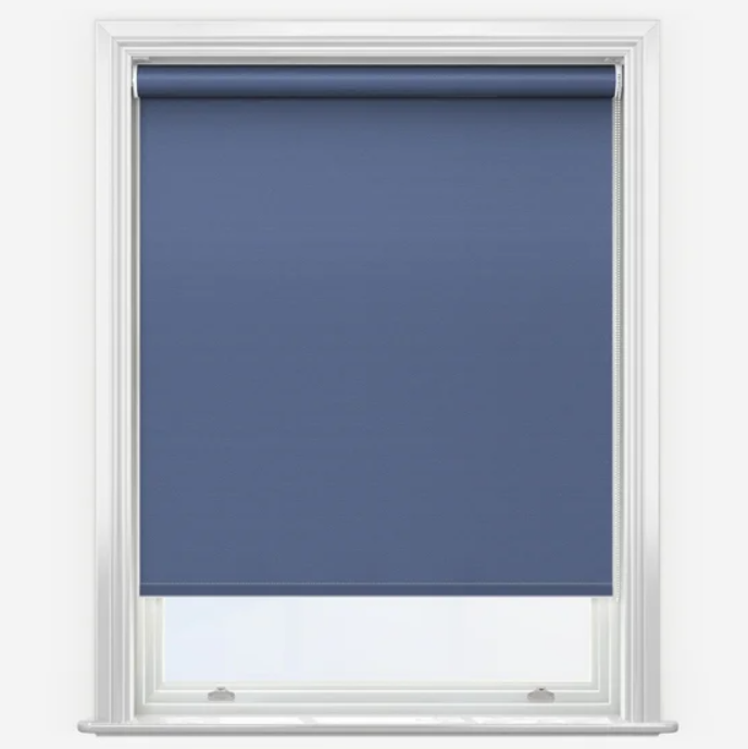
Blue is a perennial favourite in interior design. From airy sky tones to deep navies and petrol blues, it brings a sense of clarity and sophistication to any space. Blue naturally recedes in the visual field, making it an ideal base colour for rooms where relaxation or focus is a priority.
Red – warm, honest and emotional
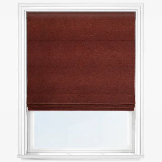
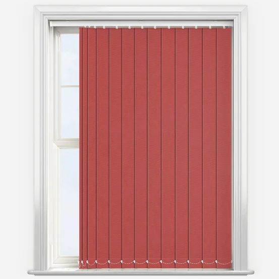
Brick red – rooted in clay, terracotta, and russet tones – is having a major moment in interiors. Earthy and inviting, this colour brings an undeniable sense of warmth and authenticity to any room. Whether you call it terracotta, burnt sienna, or rust, the appeal lies in its natural origin and grounding presence.
Bringing them together
Blue and red are opposites on the color wheel, offering a complementary contrast. It is here where their strength together lies, as one is cool and calming, while the other is warm and energising. From heritage-inspired interiors to southwestern design, this pairing is being used in a wide variety of ways. So how do you strike the right balance and make this pairing truly shine in your space?
Whether you lean into bold contrasts or subtle layers, the balance between blue and brick red brings depth, warmth, and harmony to any interior. This colour pairing proves that opposites don’t just attract – they elevate. So, if you’re ready to refresh your space with colour that feels both grounded and expressive, let blue and brick red lead the way.
Shop our favourite blue and brick red blinds

Share this post
Other posts you may be interested in
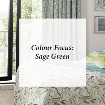
Colour Focus: Pink And Green
By Ana Zuravliova

Beat The Winter Blues With….Blue
By Ana Zuravliova
Colour Focus: Pink And Green