Colour Of The Month: Beautiful Blues
By Ana Zuravliova
Thanks to popular culture, having the blues is associated with sadness. We don’t agree with that, and today we’ll show you just how refreshing and energising shades of blue can be. To achieve this, we’ll be looking at the paler end of the spectrum, from turquoise to petrol blue, and a lot in between.
Table of contents
The benefits of shades of blue in interior design
Few colours stir emotion as deeply within us as blue. We recently covered the benefits of dark blues in our Colour Focus: Dark Blue blog, however lighter shades of blue provide equally emotive and positive vibes in a space.
Pale blue makes us feel limitless potential. It conjures memories of the sky and the sea, both of which have inspired countless generations to do great things. This feeling of calm and peace, which light blue embodies, can be enjoyed around the home. Bathrooms, kitchens and living rooms in particular benefit from a well-chosen pale blue shade.
While it’s not associated with a warming feeling, light blues are also great in the bedroom, especially when it’s a more interesting tone such as a seafoam or closer to turquoise. These tones will help you unwind and relax following the rigmarole of the day.
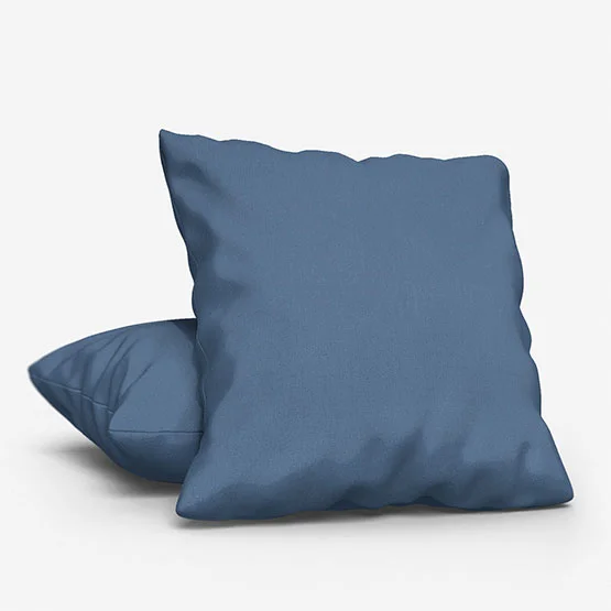
Incorporating different shades of blue in a single space can also create a layered and textured effect. Pair lighter blues with darker shades like navy or indigo for contrast, or add pops of teal, royal, or aqua for a touch of sophistication.
Let’s take a look at some specific pale blues and gather some fresh home décor inspiration for your interiors.
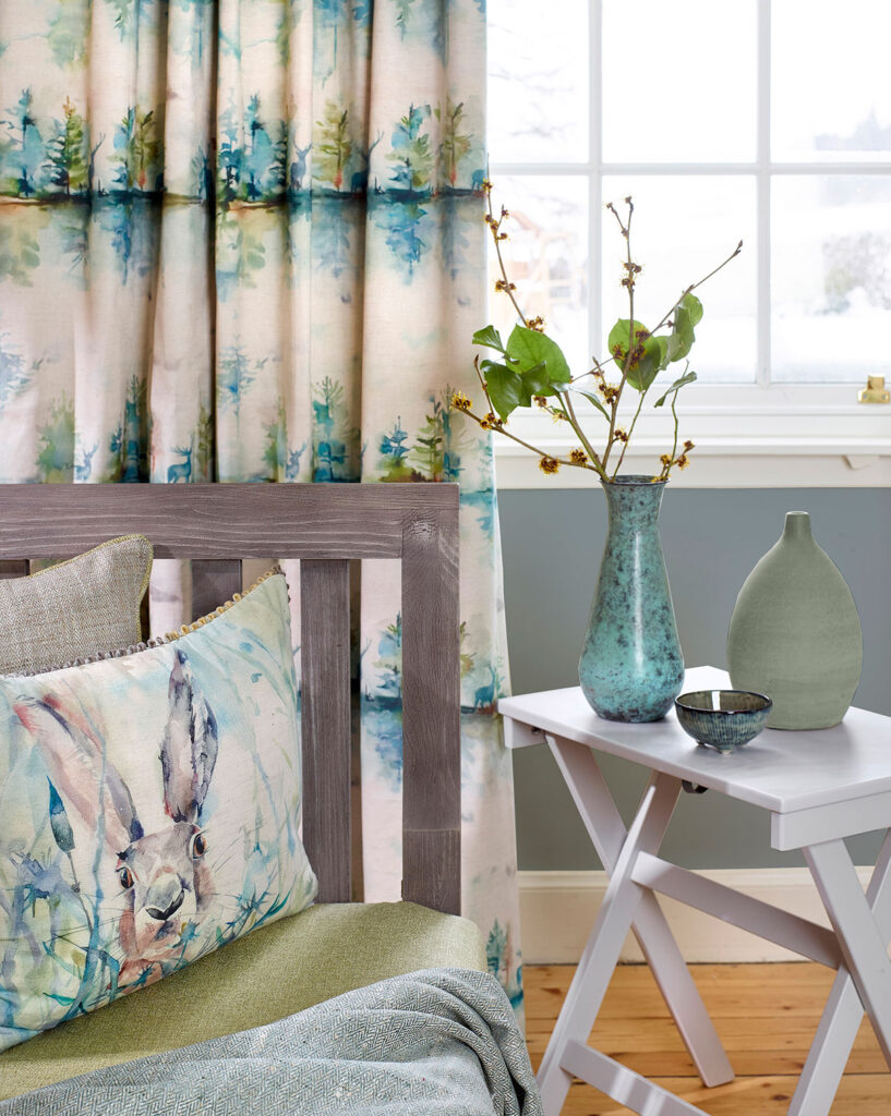
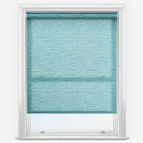
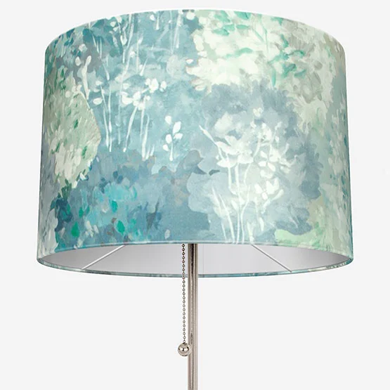
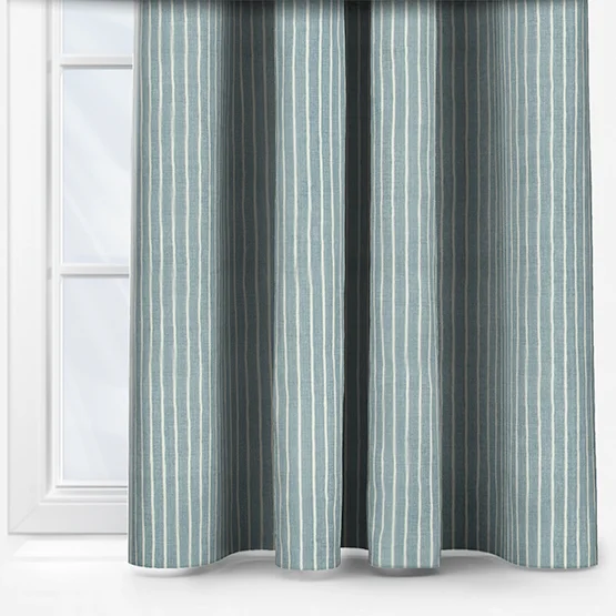
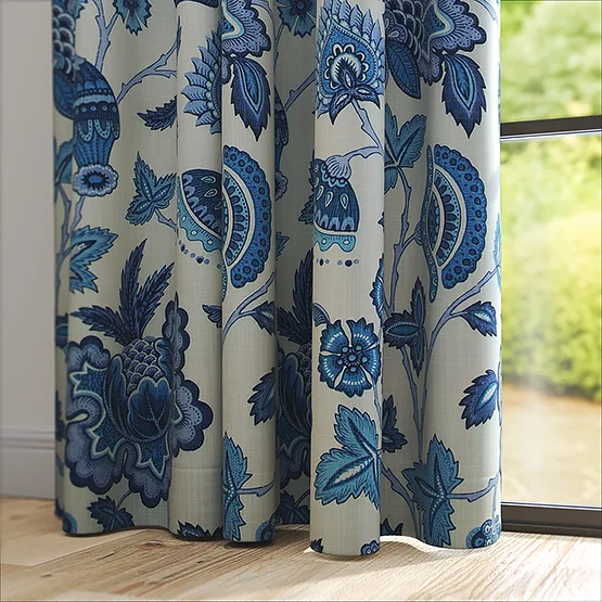
Turquoise interior design
Turquoise is a fantastic shade for interior design. It’s subtle, invigorating and what’s more, partners well with a great selection of other colours.
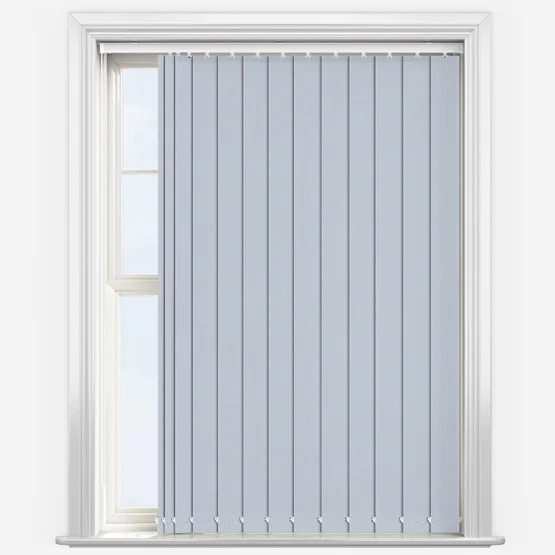
Blue-green tones such as this are linked to the natural world, good health and stability. They work particularly well in a Roman, vertical, or roller blind; especially if a similar shade is used throughout a room, for example a sofa, cushions, pillows, or lampshades.
Teal, which shares qualities with turquoise, combines the calming properties of blue with the energy of green. It works in a variety of styles, from bohemian to mid-century modern, and pairs beautifully with warm wood tones and brass accents.
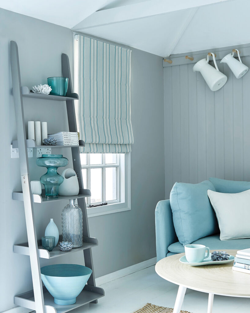
Sky blue interior design
Compared with turquoise, sky blue is a paler, more “bluer”, shade of blue. This tone is eminently energising and is the perfect colour to mix into a predominantly white space. If your space is mostly white – any shade of white – look to sky blue as a block colour. Again, Roman, roller and curtains are an excellent starting point.
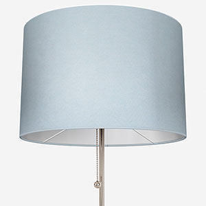
Moreover, sky blue is a brilliant addition to a darker shade of blue, particularly since it will make the space and colour pop. To achieve the best effects with its darker cousin, consider using sky blue as a part of a broader pattern, or as a spot colour. Cushions, lamp shades, and a supporting role in a patterned curtain are easily some of the best ways to enjoy this colour.
Sky blue is reminiscent of clear, sunny days and can bring a fresh element of the outdoors inside. Pair it with natural materials like wood and stone, as well as indoor plants, to enhance the calming effect.
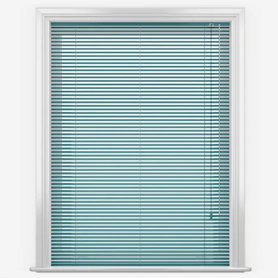
Petrol blue interior design
The one word that best sums up petrol blue is, “deep”. This is a very luxurious colour which can fuel the energy and positivity of a space. The easiest way to use petrol blue is as part of a contemporary interior design scheme however, when done correctly, you can enjoy a fun twist on traditional design too.
For a modern space, look at sleek, angular designs – whether it’s the shape of the furniture or the patterns featured upon them. Also look to use petrol blue in a soft material that’s pleasant but reserved. Wools and linens are fantastic options.
To play with traditional interior design, petrol blue works equally well with velvet and more rounded pieces of furniture.
Petrol and navy blues can be used to create a sophisticated, contemplative atmosphere. In bedrooms and living rooms, these darker shades help establish a cosy, relaxing retreat.
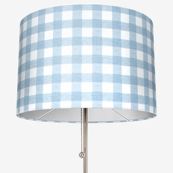
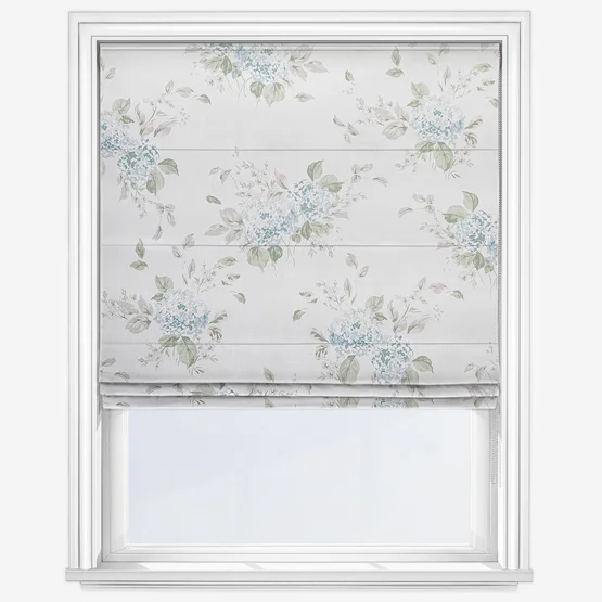
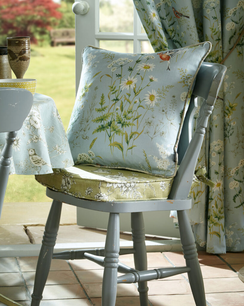
Powder blue interior design
Pastel shades of powder blue are on the cooler side of the light blue spectrum. Because of the delicacy of this tone, it’s a great primary colour for a space – particularly a relaxing space.
Large windows would benefit from an elegant powder blue curtain or Roman blind while the smaller windows in the bathroom would likewise benefit from a lovely roller blind. Because of the paler nature of powder blue, you can avoid patterns if you wish, this is because the light will interact beautifully with the colour, especially in a flowing window furnishing such as a curtain.
Powder blue works extremely well with other colours too. Whether you want spots of white, indigo or even shining yellows, powder blue will help to bring everything together.
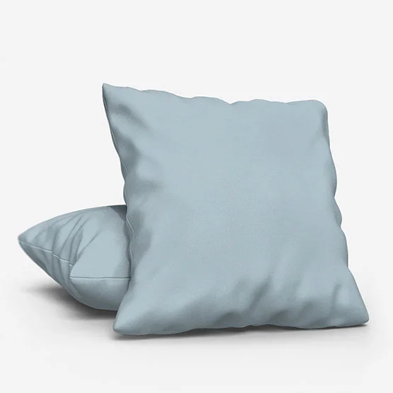
Soft blues like powder blue and baby blue are ideal for creating serene, calming environments. Pair them with white, cream, or light wood tones to enhance airiness, or layer them with darker blues for depth.
Creating a tranquil blue home
In a world humming with persistent noise and activity, finding places of peace and tranquillity becomes even more important for our well-being. Our homes should evoke a sense of calm, and blue is perfect for achieving this.
Declutter your space and focus on airy, open layouts. Light filtering through large windows or voiles enhances the calming effect.
Incorporate water-inspired elements such as tabletop fountains, or fabrics in green-blue or ocean-inspired shades. Indoor plants also help, adding a natural contrast and improving well-being.
A minimalist approach complements blue shades beautifully. Less clutter and simple, clean lines allow the soothing qualities of blue to shine, whether in furniture, curtains, or decorative accessories.
Tips for using blue effectively
Here are some practical blue interior ideas to help you balance colour, texture, and style in any room:
– Balance bold and soft blues with neutral tones like white, beige, or grey.
– Layer multiple shades for depth and visual interest.
– Test colours in natural light to see how they shift throughout the day.
– Start with smaller accessories like cushions, rugs, or lamps if hesitant about committing to walls or large pieces.
– Mix and match styles: turquoise and teal for coastal chic, powder and baby blue for serene retreats, petrol and navy for sophistication.
Incorporating different shades of blue thoughtfully can elevate your home, creating spaces that are calming, energising, and visually inspiring. Embrace blue in all its versatility, and transform your interiors into havens of both beauty and tranquility.
Other posts you may be interested in:
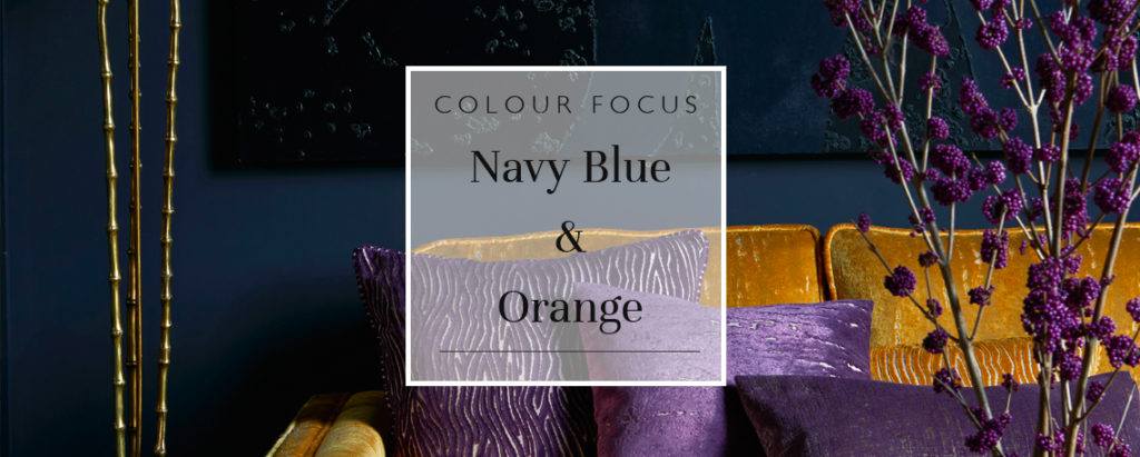
Colour Focus: Navy Blue & Orange
Navy and orange might seem an unlikely pair, but their balance of warmth and depth creates interiors that are both bold and inviting. From subtle burnt tones to punchy tangerine and royal blue, discover how to use this season’s standout combo in walls, blinds, cushions, and more.
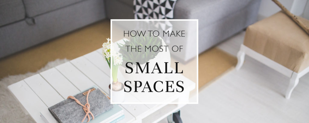
Top Tips For Small Space Living
Living in compact spaces doesn’t mean compromising on style or comfort. From multifunctional room dividers to clever use of curtains, blinds, and colour, discover practical space-saving tips and stylish solutions to maximise every inch of your home without losing personality.
Browse Our Buyers Guides
Our collection of window furnishings and homeware is defined by quality and craftsmanship. We’re confident we can provide you with the perfect product for your home, no matter your requirements. From moisture proof and stain resistant blinds for bathrooms, to blackout blinds and personalised pieces for kids’ rooms…
Share this post
Other posts you may be interested in
Colour Focus: Yellow Interior Design
By Ana Zuravliova
Black And Gold: An Award-Winning Colour Duo
By Ana Zuravliova
Colour Focus: Yellow Interior Design