Key Colour Directions for 2026
As our homes continue to evolve into places of comfort, creativity, and connection, colour remains one of the most powerful ways to influence how we feel. The 2026 palette moves away from stark contrasts and cool minimalism, embracing depth, warmth, and a closer connection to the natural world.
From earth-anchored neutrals to sea-inspired blues and soft, sun-baked ochres, this year’s colours reflect a growing focus on sustainability, craftsmanship, and lasting comfort – a palette designed for homes that feel both timeless and restorative.
1. Warm, Earth-anchored Neutrals
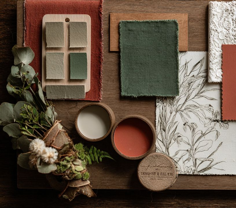
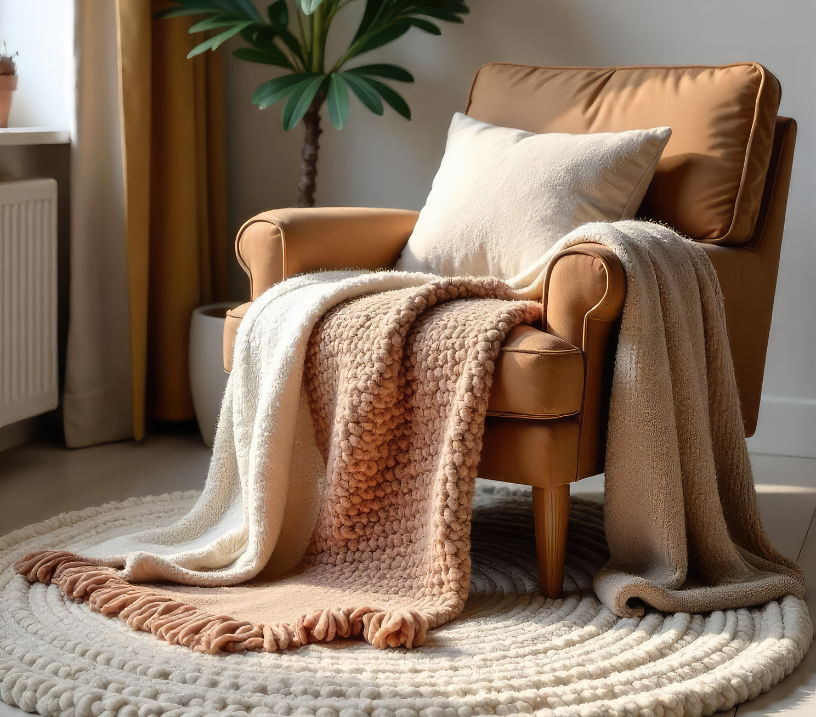
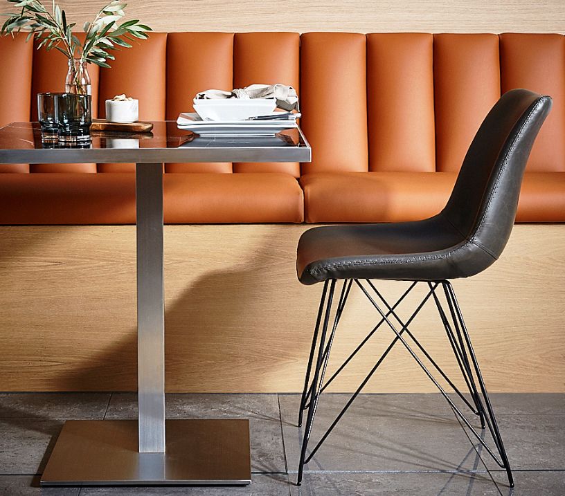
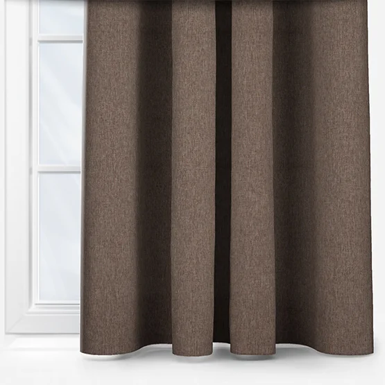
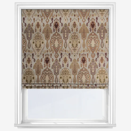
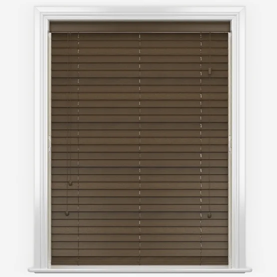
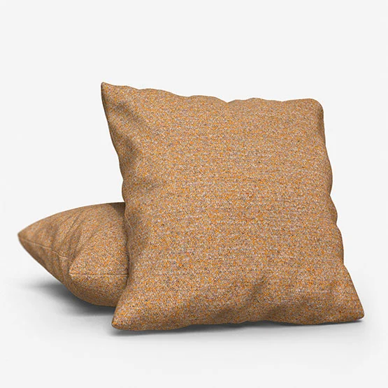
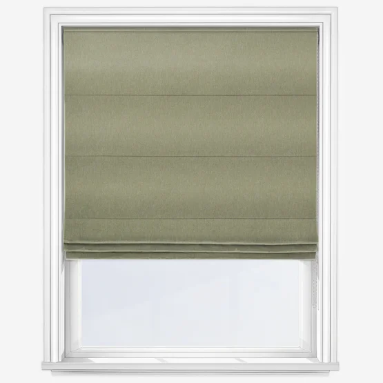
Neutrals are entering a new era – softer, warmer, and more natural. Think ecru, mushroom, and alabaster replacing the cool greys and stark whites of recent years. These shades bring quiet sophistication, pairing effortlessly with organic textures like linen, wood, and stone. Tones such as sandy taupe, camel, and cognac add understated warmth and depth, creating a calm, comforting foundation that complements both classic and contemporary spaces.
2. Rich, Deeper Colour Tones
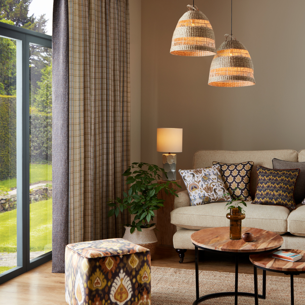
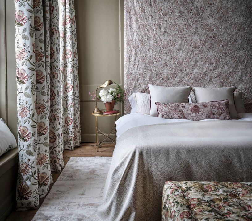
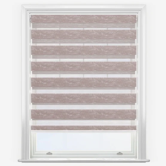
Depth continues to define the 2026 palette, with warm, saturated hues creating a sense of intimacy and richness. Oxblood, damson, plum, and cognac tones lead the way – deep yet soft, offering a grounded sense of luxury.
Alongside these, smoky greens and sea-inspired colours – from kelp and seaweed to algae – introduce cooler undertones without feeling cold. These shades sit between blue and green, evoking the calm, layered hues of the coast rather than the sharper tones of teal. Together, they bring a soothing balance of warmth and serenity to the home.
3. Colour as Statement – Tonal Layering & Subtle Expression
2026 celebrates colour as quiet confidence. Instead of strong contrasts, interiors will layer tonal variations of a single hue, creating depth through subtle shifts in shade.
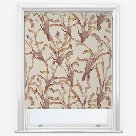
Think clay merging into baked terracotta, sage blending into kelp green, or baked ochre deepening into golden camel – palettes that feel rich, grounded, and harmonious. Layering tone-on-tone allows for expression without excess, delivering an elegant, modern form of colour storytelling.
4. Nature-Inspired Integrity & Soft Pastels
Nature remains a central influence, but the palette is evolving to include dusty, soft blues, muted greens, and powdery pinks that bring serenity to interiors. These tones – gentle yet optimistic – evoke dawn skies and faded botanicals, offering a lightness that pairs beautifully with natural fabrics and tactile surfaces.
Alongside these softer hues, warm olives, clay, and buttery yellows add balance and depth, reflecting the enduring desire for homes that nurture wellbeing and connection.
5. Metallics, Chrome & Retro Revival Accents
While texture and natural materials continue to dominate, metallics are making a refined comeback. Expect brushed silver, pewter, and deep baked golds – not high-shine finishes, but soft, burnished tones that add quiet glamour.
Subtle nods to 80s chrome bring a modern contrast to the earthy palettes of 2026, creating light, reflection, and a touch of retro sophistication. These metallic accents pair beautifully with warm berry shades, deep blues, and mushroom neutrals, adding polish and balance to more grounded colour schemes.
Looking Ahead
While these shades capture the mood of 2026, they’re far from fleeting. Each colour – from seaweed blues and baked ochres to mushroom neutrals and warm plum tones – is grounded in nature, craftsmanship, and comfort. Together, they mark a long-term move toward homes that feel balanced, expressive, and deeply personal.
Explore our latest made-to-measure blinds and curtains collections to discover the colours, fabrics, and finishes that bring these evolving trends to life in your own home.
Style Your Windows in 2026’s Key Colour Directions
Other posts you may be interested in
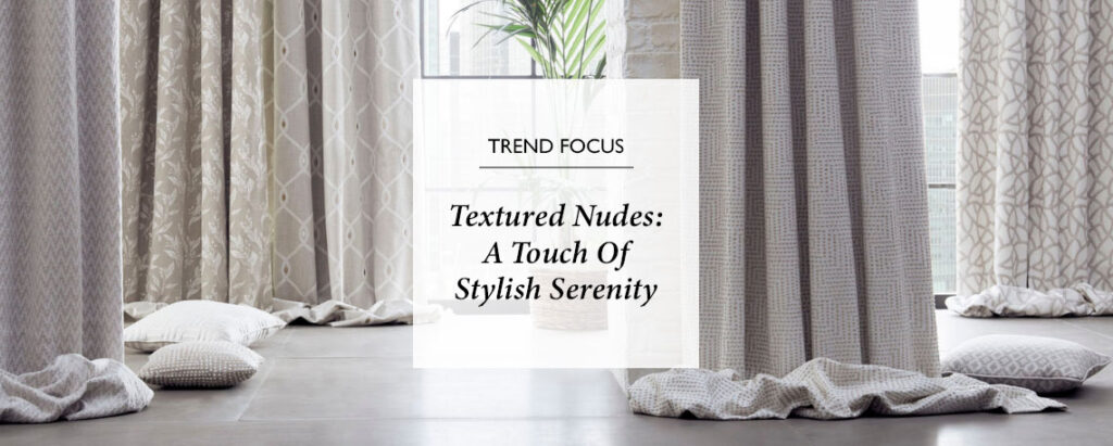
Textured Nudes: A Touch Of Stylish Serenity
Discover the Textured Nudes trend, where soft neutral tones and tactile materials create calm, inviting spaces. With layered textures, organic shapes and understated luxury, this look brings warmth and quiet sophistication to any room.
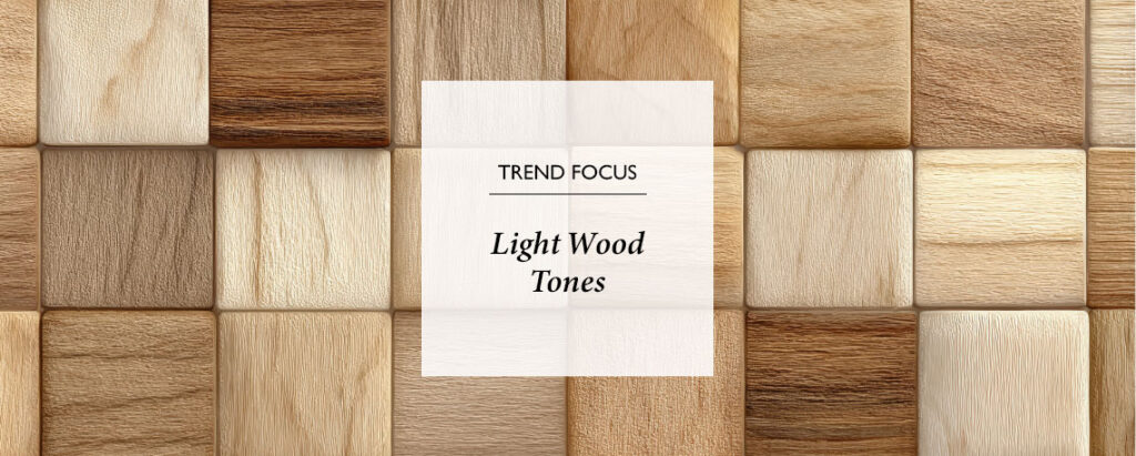
The Versatility Of Light Wood Tones
Light wood tones bring calm, brightness, and timeless elegance to any home. Layered with soft hues and textures, pale woods create airy, inviting spaces that suit coastal, Nordic, or Japandi interiors effortlessly.
Browse Our Buyers Guides
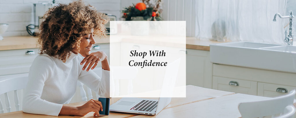
Explore hand-finished, made-to-measure blinds and homeware crafted for quality and durability. With moisture-proof, blackout and kids’ options, a five-year guarantee, Fast Track delivery & Surefit Protection, you can style your windows with total confidence.
Share this post
Other posts you may be interested in
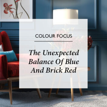
The Unexpected Balance Of Blue And Brick Red
By Ash Walker
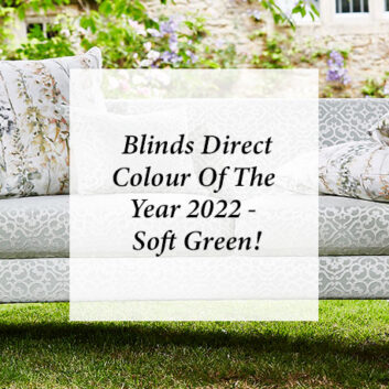
Blinds Direct Colour Of The Year 2022 – Soft Green!
By Ana Zuravliova
The Unexpected Balance Of Blue And Brick Red