A Social Snapshot: Our Favourite Posts
By Ana Zuravliova
Every day, after settling with a nice warming drink, we take a look at our Blinds Direct Instagram page and without fail we’re so, so impressed with the posts we’re tagged in. Lovely customers up and down the country continue to share amazing images ranging from explosions of colour to calm chic monochrome spaces and honestly, the design talent, attention to detail and stylishness of these images blows us away.
5 of the best social images
Today, we’re going to present five of our favourite images from the past couple of months but believe me, drawing this short list has been hard – really hard. If I had my own way this could go on for hundreds of entries!
In no particular order:
Beautiful use of blue
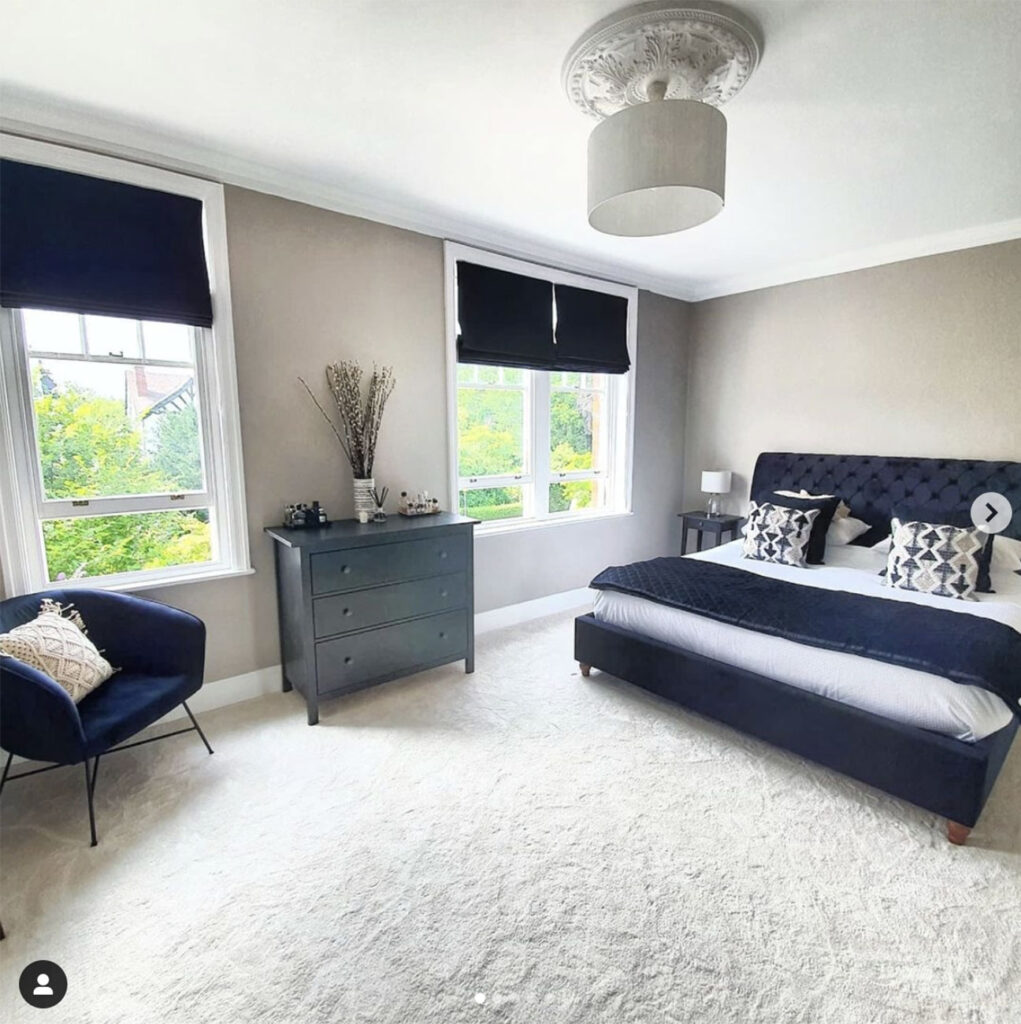
@our_victorian_renovation_story is a really cool Instagram account chronicling the considerable transformation of a semi-detached house in Stockport built in 1885 . Among the grid posts of hard graft, we came across this striking photo and – considering how much we love the combination of dark blue and off white in the office – were taken back to say the least!
A particularly nice detail in this photo is the playful use of colour. The pure white of the ceiling contrasts subtly with the off-white walls yet boldly with the dark blue. Likewise, the lighter blue chest of drawers adds an extra delicate yet noticeable statement.
Naturally we adore the dark blue Roman blinds that have been used also. Roman blinds are one of those window furnishings that effortlessly combine style, functionality and elegance and in a dark blue, you can’t go wrong!
If you’re keen to know more about how to use dark blue tones in interior design, be sure to check out our Colour Focus: Dark Blue blog.
The perfect room for kids
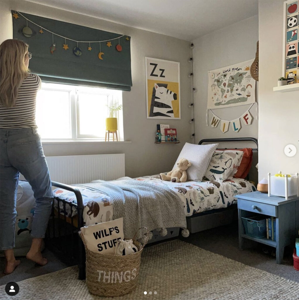
Speaking of Roman blinds, we were recently approached by the lovely @sophia.at.home to take part in a collaboration and supplied her with a Camengo Esprit Foret Roman Blind.
The soft green tone of this blind synergises extremely well with the colours used for the walls, and contrasts beautifully with the blue notes strategically placed around the space. Sophia writes in her post:
”The blind I chose for Wilf is the Camengo Esprit Foret Roman Blind which has a linen look to it. I chose this as in years to come when he needs a more grown-up space this blind is suitable, however, there are many blinds specially designed for children’s rooms on the website.”
Interestingly, Sophia’s choice of this blind was equally influenced by the lining options. The blind fitted in her son’s room features a blackout lining which helps to limit the light that enters a room. The result is an improved night’s sleep which is particularly important for growing children. For more information about window furnishings, linings and their ability to improve sleep, check out our Wake Up Well campaign.
Vibrant Venetian blinds
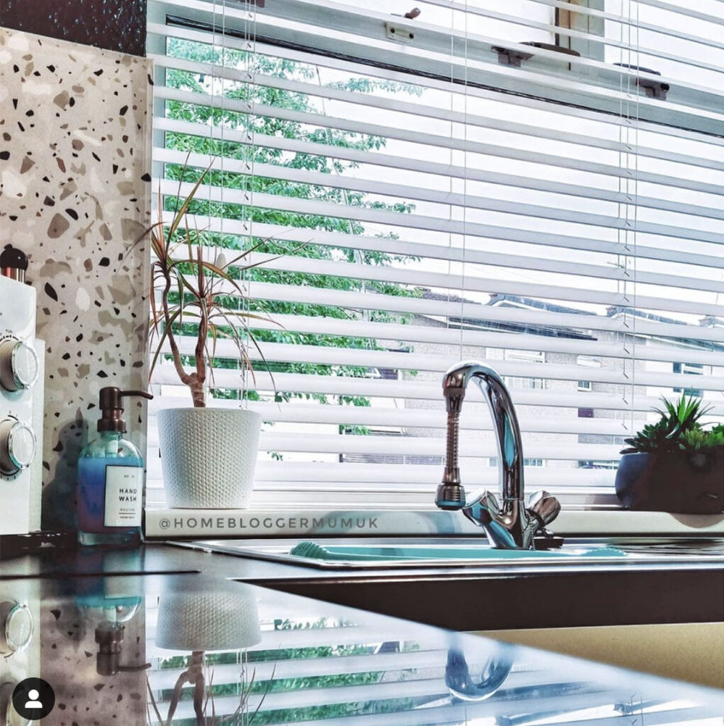
Venetian blinds – like the city they are named after – are elegant, sophisticated and eminently charming. What’s more, they’re functional too, providing a fantastic balance of light control and privacy. This balance, we feel, is perfectly demonstrated in @homebloggermumuk’s recent post.
In this delightful photo, we can see just how well Venetian blinds interact with light and the angle demonstrates how privacy is maintained without needing to block all the light from the space.
This versatility is enjoyed in millions of homes, especially since with a simple twist of the wand you can find that exact level of light you need. Plus you also have the ability to simply pull the blinds up to enjoy completely unfiltered natural light.
More locally, the post also provides a fantastic example of how a well chosen colour can help a Venetian blind integrate even into a funky, colourful design theme.
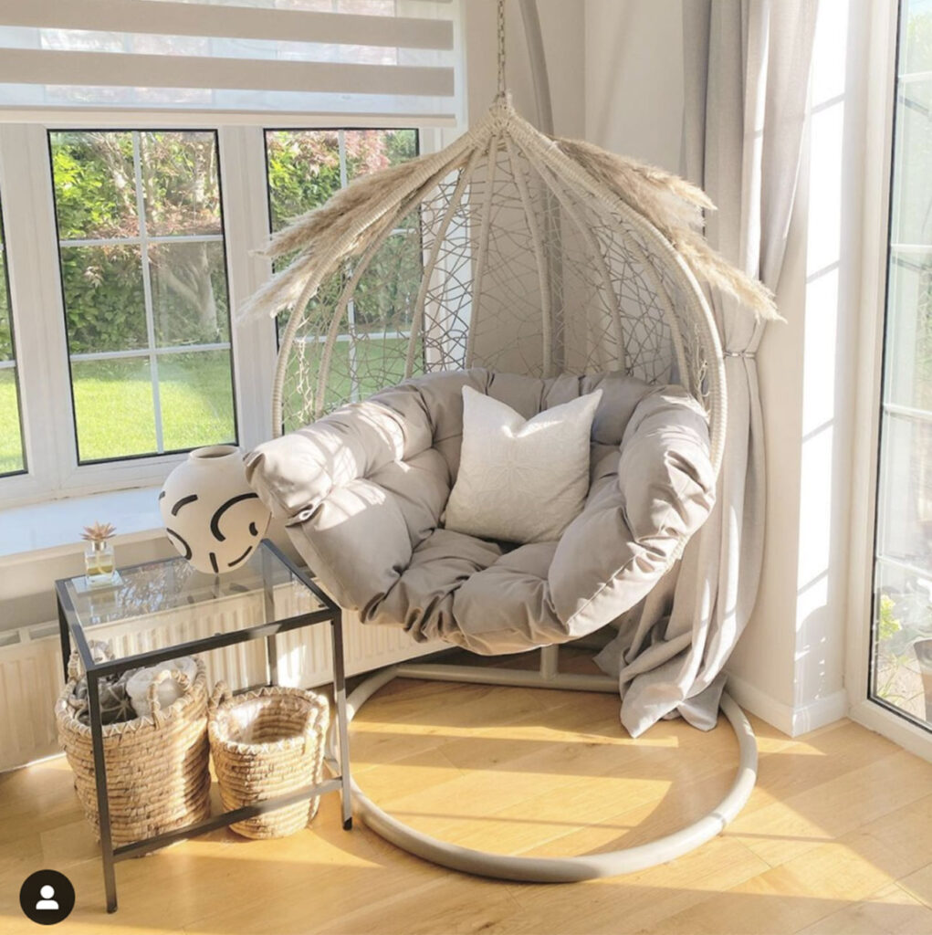
Looking cool in cream…
@mrsbakershome_ is a really inspirational Instagram account. In July, she posted the image opposite and it really caught our eye. For a few months now we’ve been extolling the virtues of natural colour palettes which can be enjoyed in a wide range of popular design trends.
The use of natural colours and materials showcased in this post are perfect for a range of design themes including scandi, Cottagecore, and even Global Nomad. Beyond the colours and materials, what’s particularly striking about this space is the use of shape.
The large, suspended chair, it’s base and the woven baskets are all very round and they contrast in a lovely way with the more angular items.
A great example of this is the Day and Night blight in the left-hand window. Day and Night blinds present the perfect balance between light control and privacy. Their alternating strips of fabric slide against each other, allowing for a change between a block colour – for full closure and privacy – and stripes that gently filter the light and views from outside.
The colour selection for this blind is excellent and harmonises exceptionally well with the overall natural theme.
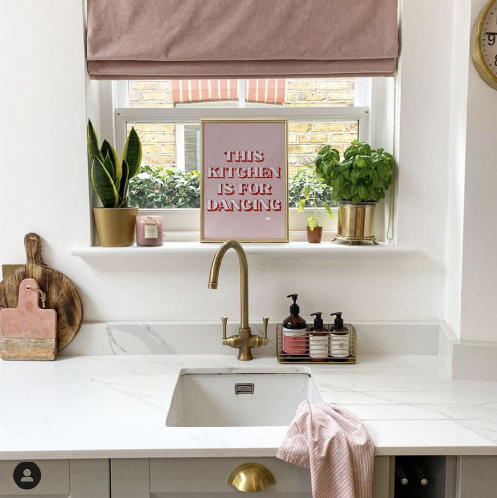
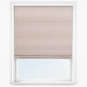
…And Pretty in pink
Last but certainly not least, we come to @housekidscats! Concise use of bold colour is a tricky thing to learn but @housekidscats has certainly mastered it.
Dusky pink is an amazing colour when stood alone or part of a broader design theme. In this post, the pink catches the eye but it’s far from overpowering.
Coupled with the white walls, the grey cupboards and especially the beautiful plants, one of which I believe is basil, this is a lovely colour palette. Again – as you may have picked up throughout this blog – we love that a pink Roman blind has been used.
The humorous “this kitchen is for dancing” sign, while fun is oddly enough a great metaphor for interior design. We’ve said it many times before, but your space should be used for – and decorated – as you see fit. Want to dance in your pink-accented kitchen, or relax in a lime green bedroom, let no one stand in your way.
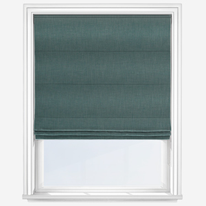
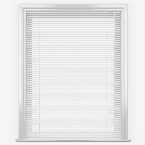
We love seeing photos of Blinds Direct products coming to life in people’s homes. If you have a lovely room set you’d like to share with us, be sure to tag @blindsdirectgb on Instagram. Moreover, if you’ve found inspiration and would like to replicate one, or more, of the excellent decors above, check out our Social Superstars collection below.
Shop Our Social Superstars:

Share this post
Other posts you may be interested in
Trend Focus: Colourful Kitchen Ideas
By Ana Zuravliova
The Silk Road: Indulgent Indian Designs
By Ana Zuravliova
Trend Focus: Colourful Kitchen Ideas