Colour Focus: Yellow Interior Design
By Ana Zuravliova
The colour Yellow is adored in the Blinds Direct office. It’s exciting, energising and eminently suitable in a range of interior design trends. From soft pastels like butter yellow to bold shades such as mustard, lemon, saffron, and ochre, yellow adds a stylish pop to any space. In this blog, we’ll explore the best yellow shades, complementary colours, and easy ways to introduce this vibrant hue into your home.
Table of contents
How to use a yellow colour
As with all colours, the colour yellow offers a great array of tones and shades. Unlike many however, all yellow tones are eye-catching and offer an amazing vehicle for adding flares of personality into a room. Softer tones are excellent dominant colours while the more vibrant end of the spectrum is hard to beat as a spot colour.
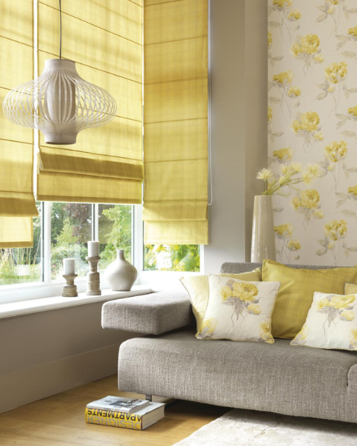
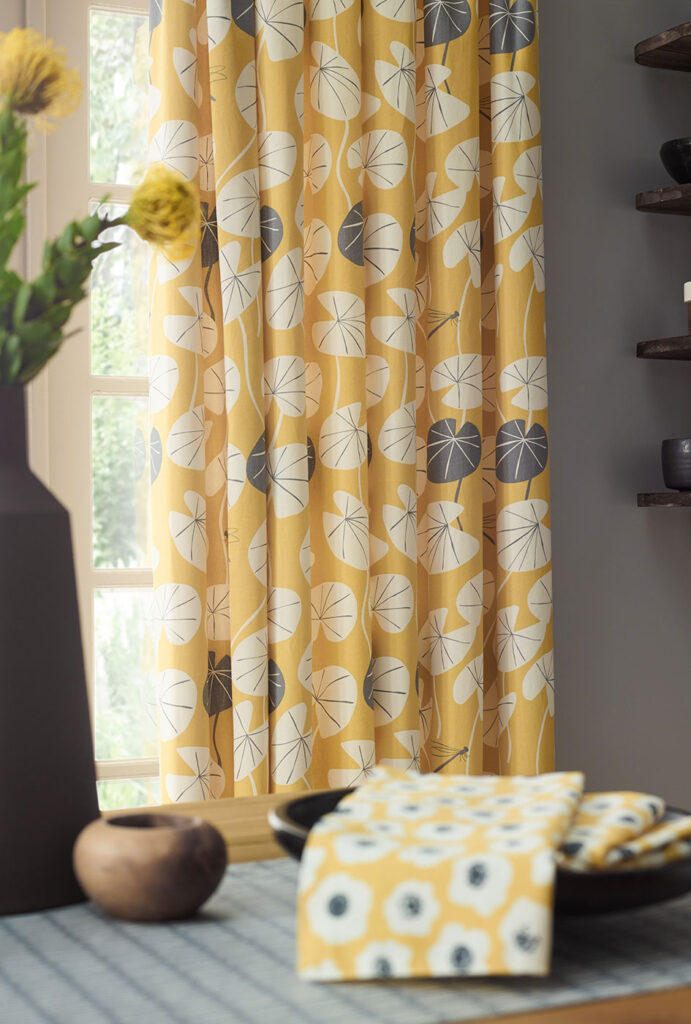
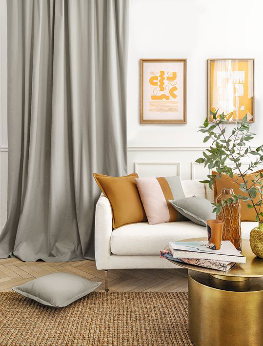
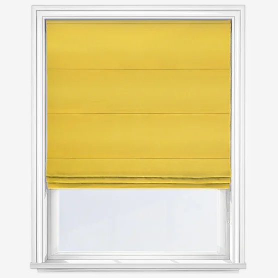
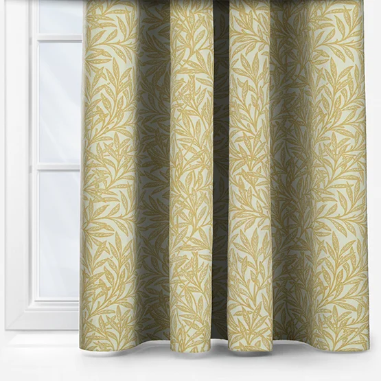
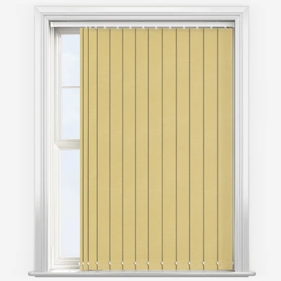
Mustard and ochre tones are excellent options for single-colour items. Yellow Roman blinds which offer an inherent comforting feeling, look elegant and modern in these deeper tones are an excellent example, as are yellow curtains.
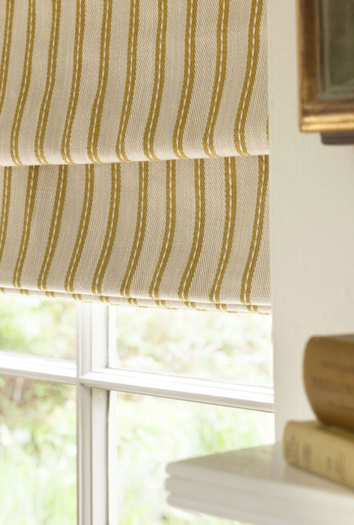
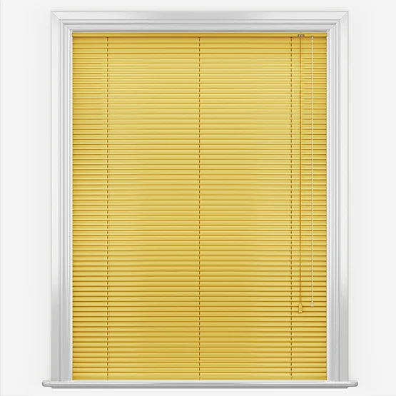
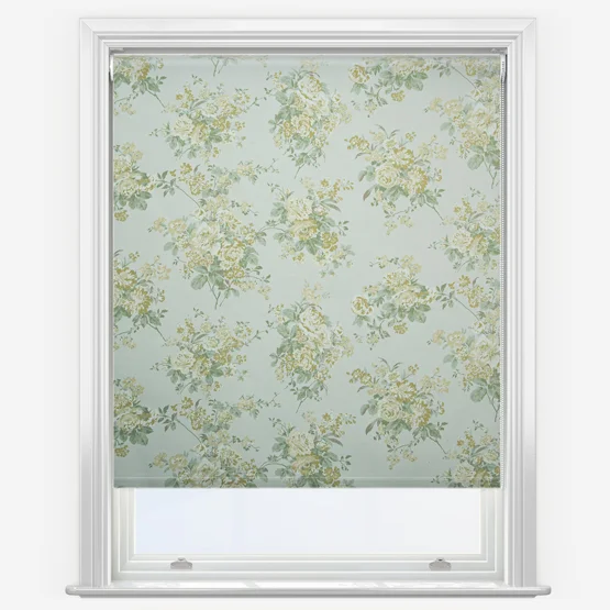
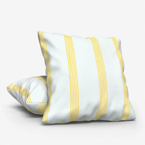
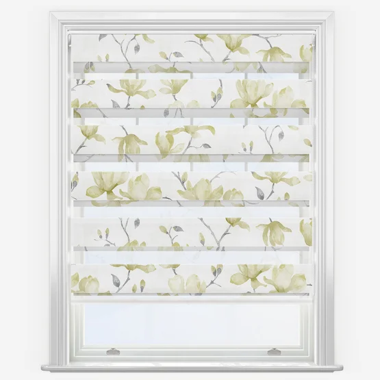
Lighter shades of yellow, including lemon, daffodil, and banana are unparalleled spot colours. While a large lemon-tone furnishing may be a little much for many themes, a dynamic yellow cushion or lampshade can add a fantastic pop to many other colour schemes. Also consider using yellow as part of a patterned fabric. Dashes of a light yellow in a Roman or roller blind – or curtain – will add interest and personality into a space without it looking over the top.
Yellow drenching
For a bold statement, consider Yellow Drenching – a trend where multiple shades of yellow are layered across walls, ceilings, furnishings, and window dressings for a cohesive, energetic look.
Yellow Drenching works best in spaces where you want energy, warmth, and a cohesive, uplifting atmosphere. Entrance halls, living rooms, kitchens, and home offices are ideal, while bedrooms can benefit from softer pastel applications. To style it effectively, consider tone-on-tone window treatments like Roman or roller blinds, balance bold yellows with neutral shades such as cream, beige, or grey, and add natural elements like wooden blinds or shutters. Layering textures—walls, trims, cushions, and wood accents—adds depth and prevents the look from feeling flat.
Butter yellow, a pale, creamy shade, is ideal for creating a serene and harmonious environment in bedrooms, kitchens, and living rooms. It pairs beautifully with neutral furnishings, natural wood accents, olive green, or burnt orange for contrast without overwhelming a space.
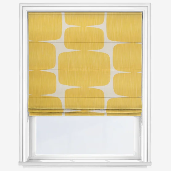
Sunshine yellow, the brightest and boldest shade, is perfect for making a big focal point. Use it in kitchens, bedrooms, or home offices, or as accessories like blinds, cushions, and lamp shades to bring warmth and cheerfulness.
Colours that go with yellow
Yellow is very flexible and goes well with a range of other colours. So, let’s see what colours go well with yellow:
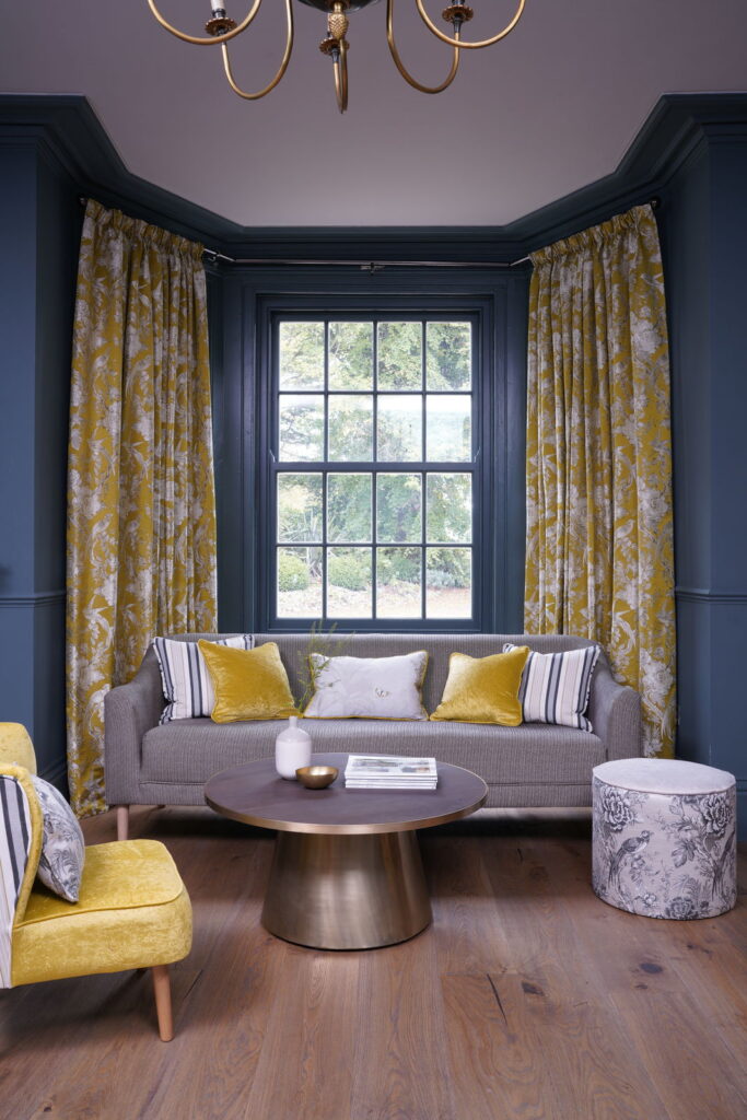
Yellow and grey – this combination works beautifully when the depth of the colours is balanced. For instance, a darker, richer grey pairs well with a lighter yellow, while a soft grey benefits from deeper, more vibrant yellow tones.
Yellow and cream – this may sound a little odd but trust us, it’s a great colour combination. A pale neutral colour such as ivory or jasmine work wonderfully when mixed with warmer yellow tones such as mustard, honey and gold. The contrast can be as subtle or standout as you wish but a cream room with accents of yellow will look fresh and provide a positive energy to a room.
Yellow and blue – yellow and blue work extremely well in tandem but it’s important to take the time to pick the correct shade and vibrancy. Pale or vibrant blues and yellows can be a little overbearing however a rich dark blue combined with limited use of a striking yellow can add an extremely sophisticated look in a space that balances traditional and modern design. For this, look to yellow cushions and lampshades for the best effect.
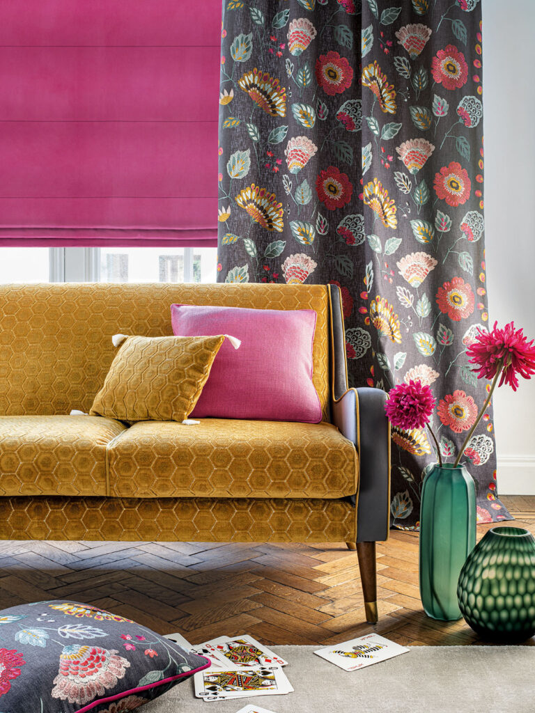
Yellow and pink – for a fun and modern design, look to combine elements of bright yellow with dusty pinks into your space. As both colours are eye-catching, try and place them both within the confines of a more neutral setting with both adding pops of energy to your overall décor.
Additional complementary colour ideas include: burnt orange, olive green, navy, raspberry, aubergine, petrol blue, forest green, and monochromatic neutrals. Soft yellows pair best with beige, off-white, or natural wood tones for a calming effect, while bold yellows contrast beautifully with darker or jewel tones.
The best yellow fabrics
As with many colours, differing shades of yellow work best in certain fabrics. This guide works well for yellow, but you can use it for other colours too:
Deeper tones of yellow work very well with heavier fabrics. The weightiness of wool and velvet, for example, synergise with energising colours such as yellow. This is because the warming feelings of both heavy fabrics and rich colours combine beautifully to create a homely effect you can enjoy effortlessly.
Conversely, paler shades of yellow work best when combined with lighter materials. Pale yellows are synonymous with crisp spring air and when combined with a cotton or linen, the final effect is a statement that makes us feel refreshed and rested.
Sunshine yellow also works beautifully in cotton, silk, and velvet. Layering textures like matte walls, glossy trims, and soft furnishings enhances depth and interest.
The psychological benefits of yellow
Of all the colours on the spectrum, yellow offers the lightest hue of all. As a result, it creates a feeling of hope, fun, and happiness. This illuminating colour lifts us up when we are down, and helps to inspire us in our search for new ideas.
The positive power of yellow has been identified by cultures around the world as one associated with light, the sun and summer. In Japan, yellow is associated with courage while for many years in China, only the emperor was allowed to wear yellow. Across Polynesia, yellow is also thought to be the colour of divine essence.
Globally, yellow conveys different meanings: in India it represents knowledge and learning, in Latin America and parts of Africa it is sometimes linked to mourning, while in Western cultures it is generally associated with summer, cheerfulness, and optimism. Butter yellow evokes calm and warmth, sunshine yellow inspires confidence and happiness, and yellow drenching brings energy and creativity to a space.
It is well known that colour can affect our psychology. For more information, be sure to check out our Psychology of Colour: Positive Colours blog which talks about the benefits of yellow – among other colours.
We offer a brilliant selection of yellow products on the website. From patterns including dainty spots of yellow to bold yellow curtains, and now you know the best colours that go with yellow, you’re guaranteed to find your perfect item on the website. To help you in your task, simply click the filter button and scroll down to yellow to enjoy the range today.
Shop our yellow products:
Other posts you may be interested in:
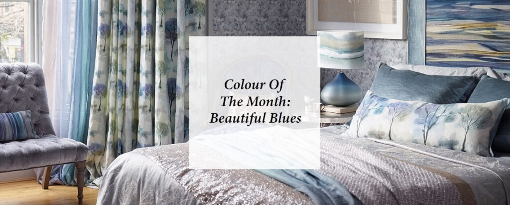
Colour Of The Month: Beautiful Blues
Blue in interior design offers a perfect balance of calm and style, from soft powder and baby blues to vibrant turquoise and deep petrol shades. Layering different tones and pairing them with complementary colours and natural materials can create serene, energising, or sophisticated spaces.
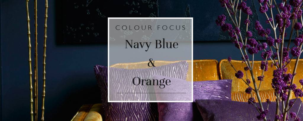
Colour Focus: Navy Blue & Orange
Navy and orange might seem an unlikely pair, but their balance of warmth and depth creates interiors that are both bold and inviting. From subtle burnt tones to punchy tangerine and royal blue, discover how to use this season’s standout combo in walls, blinds, cushions, and more.
Browse Our Buyers Guides
Our collection of window furnishings and homeware is defined by quality and craftsmanship. We’re confident we can provide you with the perfect product for your home, no matter your requirements. From moisture proof and stain resistant blinds for bathrooms, to blackout blinds and personalised pieces for kids’ rooms…
Share this post
Other posts you may be interested in
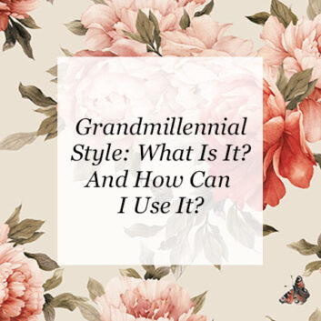
Grandmillennial Style: What Is It And How Can I Use It?
By Ana Zuravliova

Ideas For A Home Gym: How To Add Privacy
By Ana Zuravliova
Grandmillennial Style: What Is It And How Can I Use It?