Colour Combinations For Interior Design
By Ana Zuravliova
Colour is an extremely important part of interior design. Whether you want your home to be the pinnacle of modern trendiness, themed around a particular decade from history, or if you just have a couple of colours you love, picking the right colour is very important. What’s more, finding the best colour combinations is also extremely important.
What are our 5 best colour combinations?
In today’s blog, we’ll be looking at our top five best colour combinations which we think could add a real style statement to your space without too much fuss.
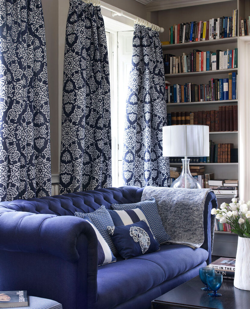
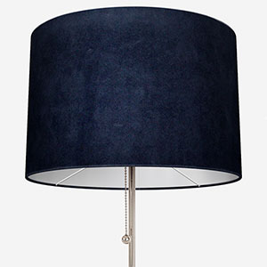
Neutrals and blue colour combinations
Monochrome interiors have been popular for a very long time. The contrast between black and white can be seen in homes from the 18th century through the 1960s to today. The right combination of blue and a neutral colour however captures the charm and excitement of a traditional monochrome décor, but with a more homely, modern twist.
Blue can sometimes feel like a tricky colour to use in interior design but when you see it in the flesh, it looks fantastic. The contrast with a neutral tone can be dark and classic, or poppy and fun, it all depends on the colours you select. At opposite ends of the spectrum, you could consider indigo and pure white – or turquoise and an ivory, jasmine or even sandstone tone.
To make the most of this striking yet chic colour combination, we recommend you designate either colour as your primary, and the other as your secondary – don’t make a 50/50 split. Dark blue walls with similarly toned blue curtains would benefit from off white lamp shades and cushions. Similarly, a vibrant blue supporting a mostly off-white space will add energy to your décor. We think a sophisticated Roman blind would be perfect in such a room. You could even look to introduce a third colour such as blue grey within your space.
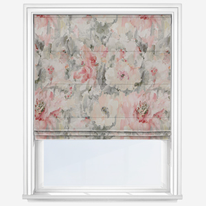
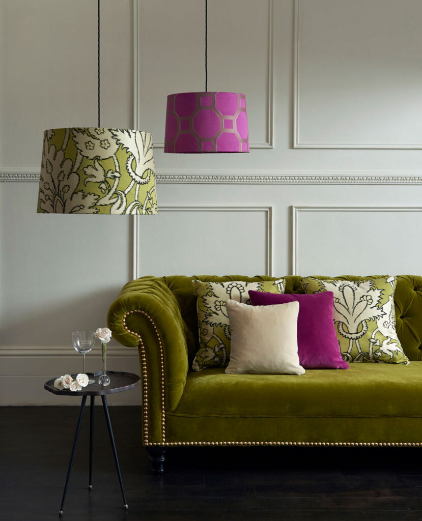
Sage and pink colour combinations
These colours may seem unlikely bedfellows but trust us, they are as well suited as Morecambe and Wise.
Soft, delicate blush pinks coupled with refreshing sage tones are well know as calming and comforting colour combinations. One of the reasons why this combination works is the versatility of pink. Shades of pink will work wonders with colours from blues to yellows but when matched with a refreshing green, the result is a space that helps us relax and energise after a long day.
Moreover, this is a combination that will make any home feel contemporary and modern without it feeling over the top. Pinks and greens can also be used in any room in the house, from dining rooms where you entertain guests, to the bedroom where you revitalize.
In the bedroom, for example, you cannot go wrong with lovely green bedding with soft, comforting pink accent cushions resting against the bedhead. A green feature wall and spots of pink in your lampshades will further enrich the overall style of the space. For the windows, you can look for a furnishing that showcases one of these colours or move to something more exciting and use a floral or geometric pattern that celebrates both. Don’t forget you can always add extra pops of green with some well-chosen plants!
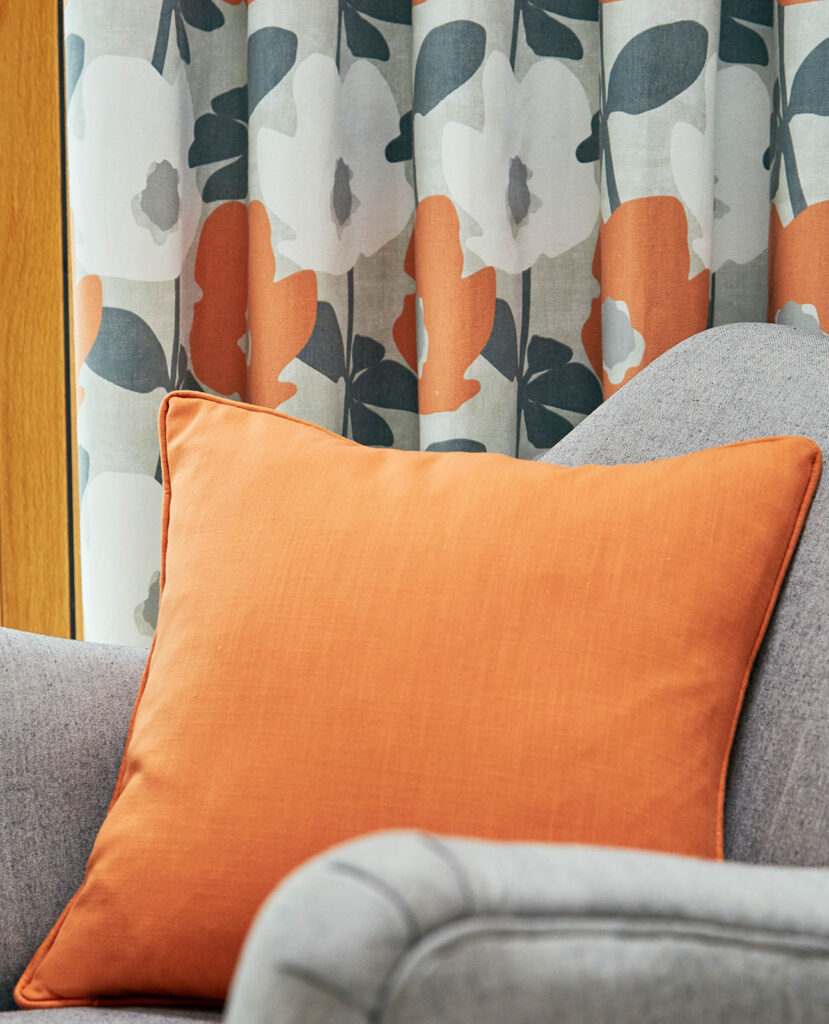
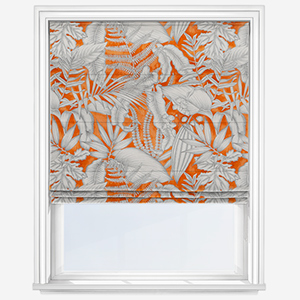
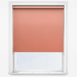
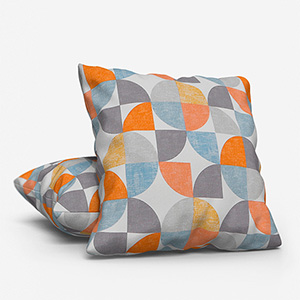
Orange and grey colour combinations
Few colours are as energetic as orange, or calm and collected as grey. This contrast in emotive power makes these colours one of the best colour combinations to use in the home. What’s more, the variety in tone and shade for both colours means you’ll easily find the perfect combination.
One of the easiest ways to find the right colours is imagine a sliding scale where the lighter, more vibrant the orange becomes, the darker the grey. This contrast will help make the most of both colours. If you love anthracite in interior design, limited use of a vibrant orange tone is the perfect accompaniment. On the other hand, if you like soft, cooling grey tones, a cantaloupe or honey tone would work a treat.
Darker, earthier shades of orange are also great to pair with pale grey, those on the spectrum that are almost white. With any of the combinations highlighted in this section, consider using your shades of grey and orange as part of a pattern in a modern window furnishing such as an orange roller blind which works well in an orange colour combination living room. Geometric designs tend to offer the best way to enjoy these excellent colours.
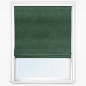
Moss and stone colour combinations
There is an established idea that what works well as part of a lovely snapshot in nature works well within the home. We need only fleetingly imagine rolling hillsides and fog-clad moors to picture beautiful stone flanked by beautiful moss.
This combination, as important as it is in nature, will make an elegant statement in your home. A few years ago there was a movement to use actual moss on the wall however you needn’t be that drastic. Moss green, like the other natural green tones in today’s blog, reminds us of our relationship with nature. This connection can help to create a relaxing and soothing environment.
Similarly, stone greys also remind us of the great outdoors. This shade is elegant without being overpowering and as a result, it is our recommendation that you use stone grey and moss green in almost equal measure. Stone grey furniture, cushions and lampshades combined with moss green walls and a matching green Venetian blind – plus plenty of plants – will make a very cool statement while helping you unwind.
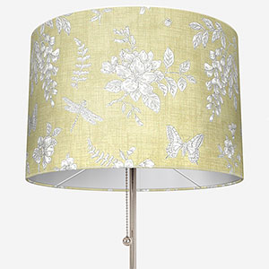
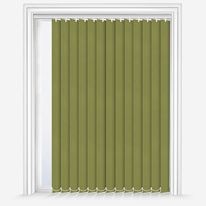
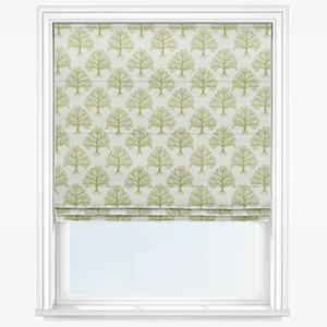
Green on green colour combinations
While the rest of our examples in today’s blog relate to combining different colours, don’t forget that you can create visual balance and harmony by using differing shades of the same colour.
Green on green is one of the best examples of this. As you’ll have seen, we believe that green is one of the most versatile colours to inject into your interior design. The myriad shades available range from deep, dark bottle greens through to energising eucalyptus and they really harmonise together. Green also affords you the opportunity to play around with fabric.
For the paler shades, consider lighter materials and conversely, darker greens look best when combined with more luxurious, heavier fabrics. A moss green linen lamp shade for example would look striking next to a quality racing green velvet Roman blind. Be sure to think about introducing some plants into the décor too to really knit your space together.
Our customer’s favourite colour combinations by room
Exploring which colours are the best for your space is fun and important for creating your dream home. With individual rooms filling differing requirements in the home, certain colour combinations work best in different spaces. To give you some inspiration, we’ve included our customers’ top colour combinations by room.
Best colour combinations for kitchens
Kitchens are home to fresh foods, good conversation and regeneration. As a result, different shades of green and white are one of the best colour combinations for these spaces. The green will help you unwind, relax and feel comfortable, while the white will help you focus on the delicious tasks at hand!
Best colour combinations for living rooms
For the living room, few combinations are as comforting as blue and dark orange or terracotta. The blue will help you to unwind after a busy day while the orange will contrast beautifully with the blue adding warmth and a feeling of peace. To further add to the warming feeling, add a free thermal lining upgrade to your Roman blinds or curtains!
Best colour combinations for bedrooms
In any bedroom, creating a decor that helps us to relax and unwind is of paramount importance. By mixing dark brown shades with warming neutrals, you can enjoy a space that relaxes you. For maximum impact, consider adding a blackout lining to a dark brown curtain to enjoy a perfect night’s sleep.
To see your chosen colours and fabrics in the flesh, order your eight free samples today!
Share this post
Other posts you may be interested in
Blinds Direct Colour Of The Year 2022 – Soft Green!
By Ana Zuravliova
From The Archives: Interior Design Styles Making A Comeback In 2022
By Ana Zuravliova
Blinds Direct Colour Of The Year 2022 – Soft Green!