Colour Focus: A Soft Summer Colour Palette
By Ana Zuravliova
We were thinking about what a fresh soft colour palette might look like, then inspiration struck so today we’re going to be providing you with our very own special soft colour palette for summer 2022. Perfectly combining the colours of the British countryside and the coast, there will be something in this palette for everyone. Read on to find out the shades used in our summer colour palette; and how you can incorporate them into your décor!
Table of contents
Blinds Direct’s soft summer colour palette
In today’s blog, we have something very special. In anticipation of the summer, we have curated a soft colour palette that combines some of the finest shades synonymous with the British countryside and the coast. Ranging from warming neutrals, to enriching terracotta, pale blues, and soft shades of green, this is a very powerful collection of colours!
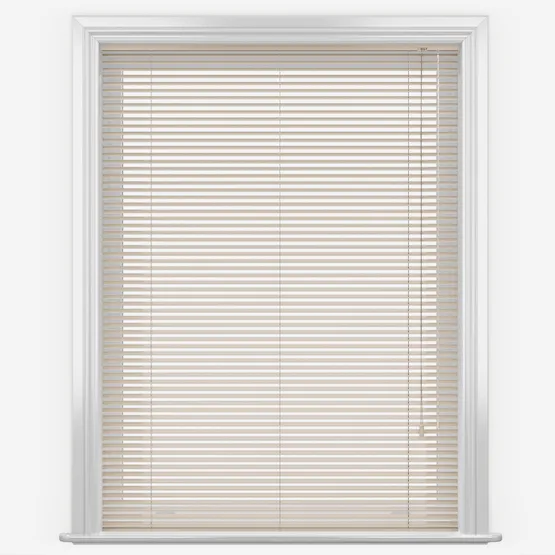
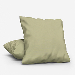
1. Warming neutrals
Starting with a strong base is a good idea, and a neutral colour foundation is always a safe bet. It is easy to live with and can be restyled again and again as the uncomplicated tones go with a wide range of more regularly evolving trends – including the other colours in the soft summer colour palette. Using warm shades during the summer will help capture the sun’s rays, making the space more inviting to relax in. Moreover, in the cooler months, they will help you feel cosy and comfortable. Some may think the use of simple shades can run the risk of looking drab and boring, but this isn’t the case and to prove it, we have a key tip on how to create depth and style in a neutral summer space.
To incorporate pink, orange, and yellow, use your neutral base to avoid clashing. Trypink roller blinds and lamp shades with beautifully patterned yellow cushions and a block orange feature wall, set amongst neutral shades, will make a space feel youthful and dynamic – especially with jewel shades of these remarkable colours. A great detail is to have a neutral curtain outside of a window recess, with a pink blind within which can be dramatically revealed.
Exploring coarse and sleek textures
Texture and finish are easy ways to bring 3-dimensionality to a neutral decor. The use of texture will help the natural light reflect and bounce off the varying surfaces creating delicate light and dark spots within the space.
When we think of texture, the first thing that springs to mind is chunky weaves and rough surfaces. Nonetheless texture can also relate to smoother, polished surfaces. A sleek surface will refract light back into the space, creating highlights and lifted points of interest. The shimmering metal of quality aluminium venetian blinds will allow light to dance around the space with ease. The sleek slats will not only bring in a form of texture to your space, but the horizontal lines will create a modern aesthetic within the space, working on the minimalistic approach.
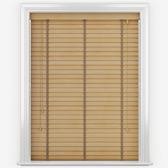
Another way to bring texture into the space is through the use of natural elements such as wood. Having the opposite effect to aluminium blinds, wooden blinds and shutters will bring in a rugged look to the space, creating the depth mentioned above.
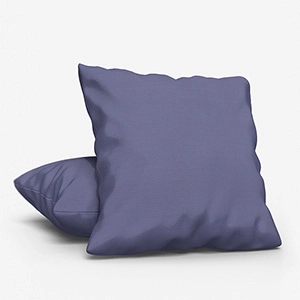
2. Pale blues
Pale blues instantly transport us emotionally to the seaside, and where else makes us feel simultaneously calm and energised? Incorporating shades of blue into a décor will have the same impact, creating the perfect environment for hosting and relaxing in this summer.
Blue voiles are a wonderful addition to the space when creating a calming sensation, as the lightweight sheer fabric will flutter in the summer breeze creating that sensation of being by the sea.
Alternatively, blue vertical blinds will have the same effect of flowing in the summer wind, yet they also provide a range of practical elements. Since they offer full control over lighting and privacy, snuggling in for a movie night has been made simple with blackout vertical blinds. Simply rotate the slats until the blind is closed and you will be transported into a dark, relaxing space – perfect for movie night!
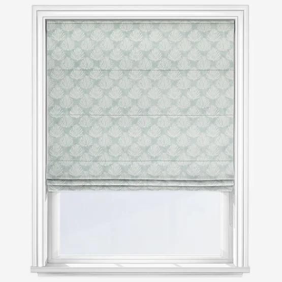
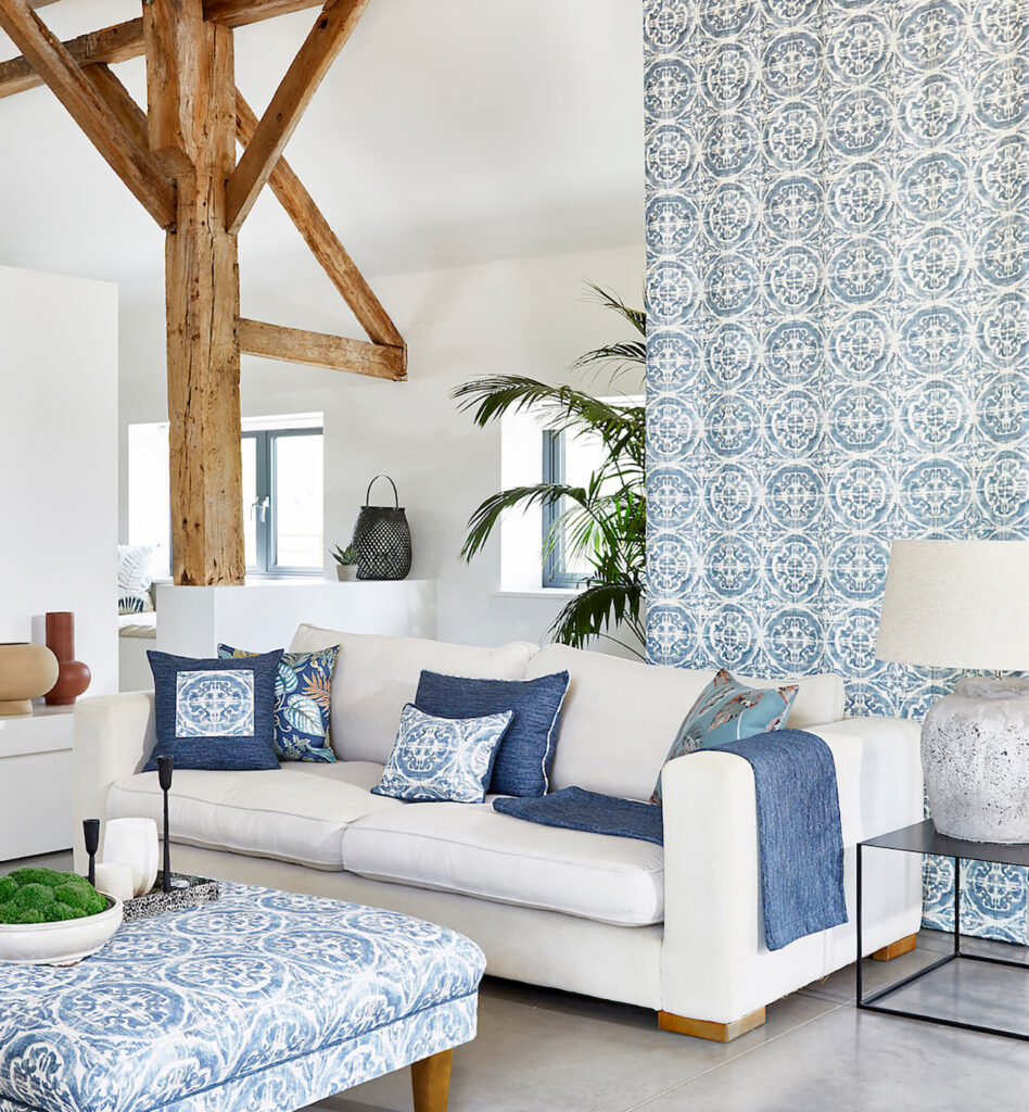
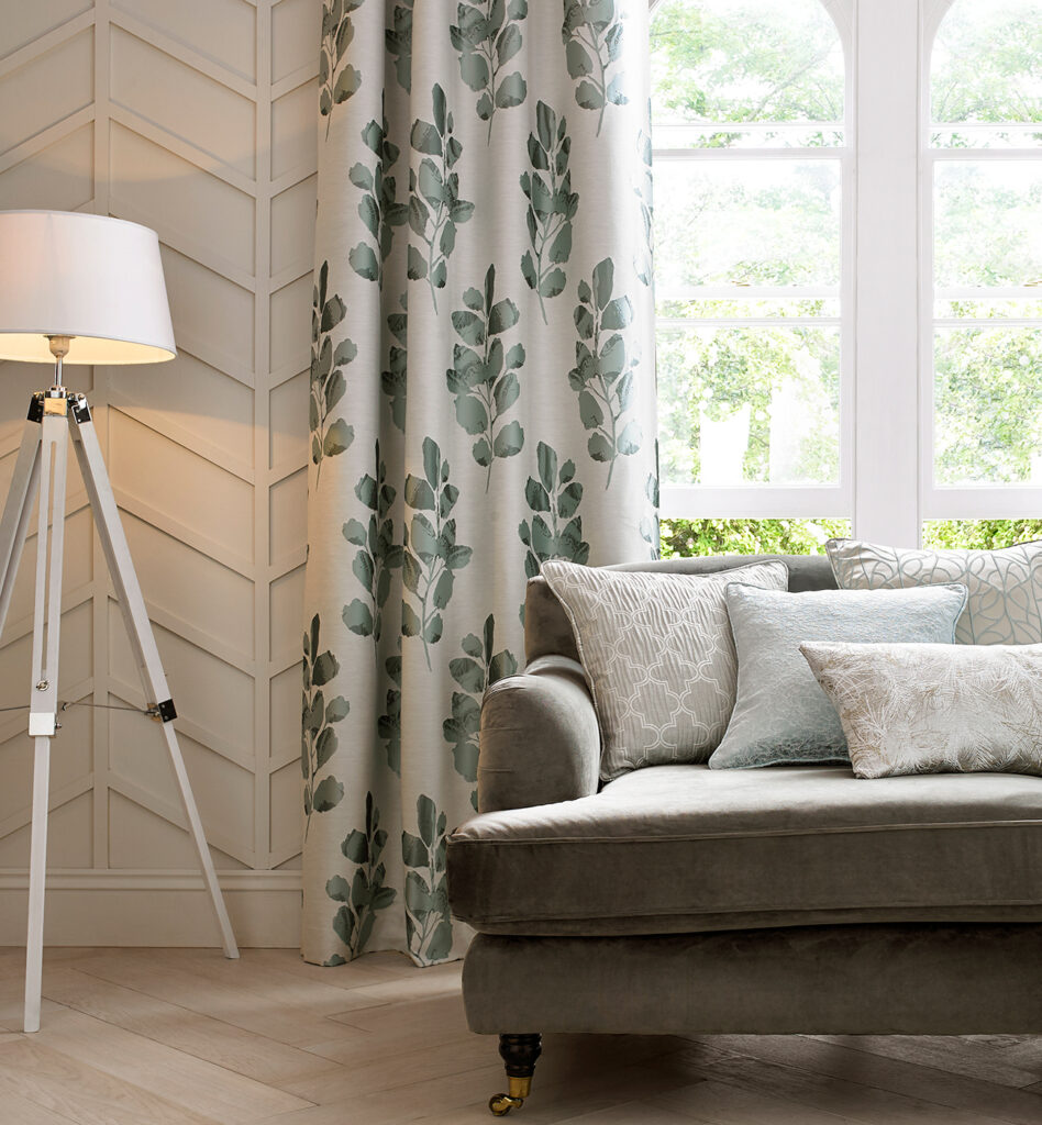
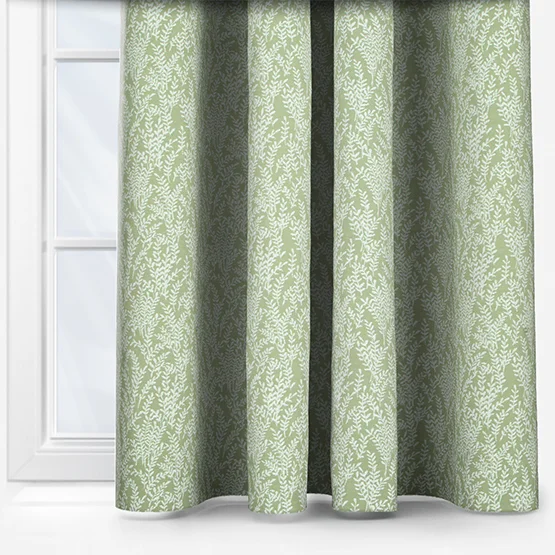
3. Soft tone greens
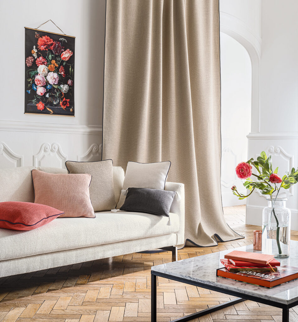
Green has long been celebrated for its connection to nature and its calming, restorative qualities, making it a timeless choice for interior design. Soft shades such as sage, pistachio, and eucalyptus create a soothing backdrop that works beautifully across living rooms, bedrooms, kitchens, and even bathrooms. These tones naturally bring a sense of the outdoors inside, helping to create a serene and inviting atmosphere.
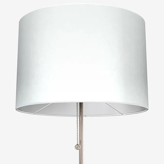
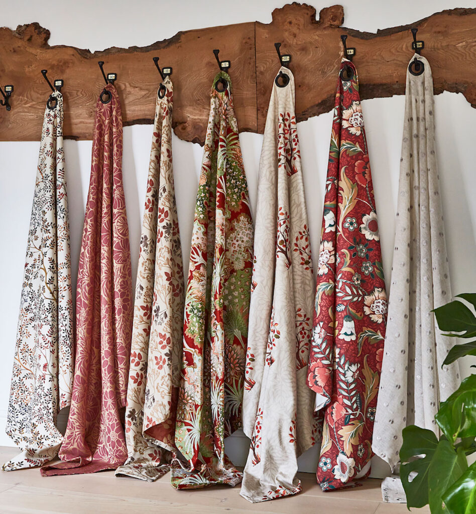
Soft green can be introduced in a variety of ways. Use it on walls for a subtle statement, or incorporate it through fabrics and accessories like linen curtains, Roman blinds, cushions, upholstered furniture, or ceramic vases. Coordinating cushions with lampshades or other accessories allows you to enhance your décor without major expense.
This colour pairs particularly well with natural materials such as rattan, blonde wood, and stone, producing a grounded, organic feel. Sage green, currently a favourite, blends effortlessly with many colour palettes, offering versatility while maintaining a calm, rejuvenating effect. Whether you use it as a statement or accent colour, soft greens can elevate any space, adding balance and freshness.
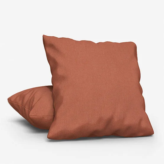
4. Enriching terracotta’s
Terracotta isn’t a colour we tend to think about when we think of the British landscape, yet there is plenty of it seen throughout the midlands and south of the country. Terracotta pulls together the Blinds Direct soft summer colour palette, transforming from a cool feeling décor into an enriching, warm space.
We find terracotta can be as dominant within your décor as you choose, from the lighter shades to the dark, almost burnt orange tones, it recreates the heat of a tropical island in your home.
Often injected into the home through the use of pots and artworks, bringing this tone into your space through soft furnishings will create a comforting feel, suitable for the UK climate. Roman blinds are the ideal starting point for introducing terracotta into the home, as the soft folds of fabric will keep the space feeling cosy while the pop of colour or pattern will add depth, instantly transforming the atmosphere.
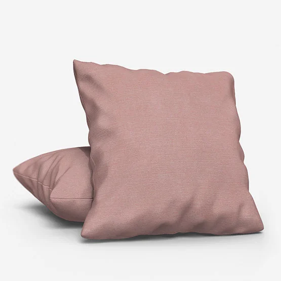
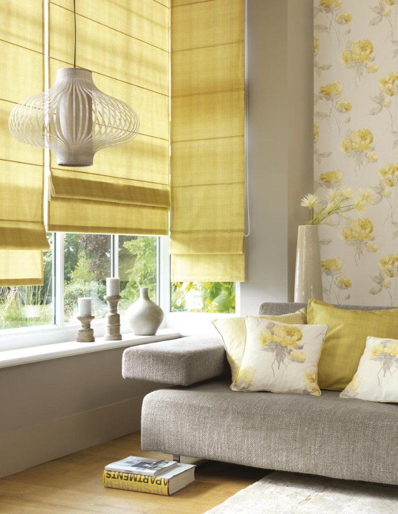
5. Butter yellow: a touch of sunshine
Butter yellow is the perfect reflection of summer. Warm, gentle, and irresistibly cheerful, this shade is creamy and understated, reminiscent of ducklings, chamomile blooms, and the light of morning.
Use butter yellow to brighten up kitchens, home offices, or hallways. A painted door, accent wall, or collection of yellow cushions and lamp shades will improve the mood of the entire space. It also works particularly wonders in smaller rooms, making them feel more open, welcoming and spacious.
6. Lilac: a romantic colour
Lilac, with its soft purple foundation offers a touch of nostalgia while adding a delicate charm that’s ideal for summer. This colour evokes scenes of blooming lavender gardens and early twilight skies, making it perfect for creating a calming, mystic atmosphere.
Lilac makes an exuberant statement in bedrooms, bathrooms, and quiet reading corners where you encourage relaxation, reflection and mindfulness. It can be used in textiles like throw cushions, lamp shades, or curtains or even as a wall colour for a subtle but distinct touch of personality.
Combine for maximum effort
The beauty of the Blinds Direct summer palette lies in its elegance and cohesion. Soft greens, butter yellow, and lilac complement one another without competing, allowing for a fashionable decor utilising all three. Together, they create an ambiance that is both fresh and timeless, perfect for welcoming the warmth and ease of the summer season.
Maximise comfort this summer with smart window solutions
As the summer solstice takes place on 21st June, the UK will enjoy its longest day, with sunlight flooding our homes and lifting moods. While extended daylight can energise our spaces, it can also make winding down more challenging, which is where the right window dressings come in.
Blackout blinds and lined curtains help create calm, darkened bedrooms for restful summer nights, while voile or sheer curtains diffuse sunlight, keeping rooms bright and airy without glare. Hybrid solutions like Day & Night blinds or layered treatments offer flexible light control, and electric blinds can even adjust automatically to suit the changing daylight. By choosing window treatments that work with your lifestyle, you can balance the energy of long, sunny days with tranquil evenings, making your home feel both inviting and restful all summer long. To discover how to keep your home cool during the hottest days, check out our blog on How To Use Thermal Blinds To Keep The Heat Out This Summer.
Share this post
Other posts you may be interested in
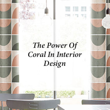
Blinds Direct Colour Of The Year 2022 – Soft Green!
By Ana Zuravliova
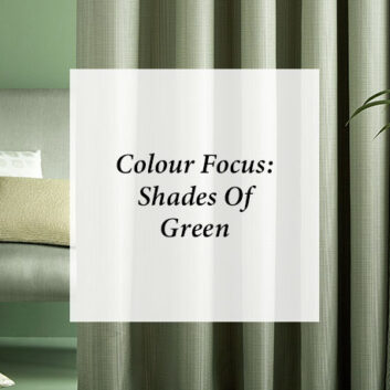
Colour Focus: Shades Of Green
By Ana Zuravliova
Blinds Direct Colour Of The Year 2022 – Soft Green!