It’s Time To Replace Grey With Off-White
By Ana Zuravliova
For a long time, grey has dominated interior design. From painted walls to wooden blinds, cabinets to cushions, grey has been a fantastic colour. That said, as with all things, to improve is to change. In the past weeks and months, there has been a shift away from grey toward shades of off-white. While this may not sound overly drastic, it does open a wealth of opportunities for refreshing your décor. Here’s how…
Goodbye to grey
Ok, “goodbye to grey” may be a little dramatic but after such a long and strong innings, this star is beginning to wane. For a long time, grey has been a fashionable and popular way to create a stylish foundation from which to build and develop your décor. Grey works with a range of colour schemes from jazzy jewel tones to deep dark alternatives or vibrant colours – it’s a very flexible colour.
That said, with all fashions, there comes a time when a colour has served its purpose and is ready to retire. The replacement for grey which we’re seeing in greater numbers is shades of off-white.
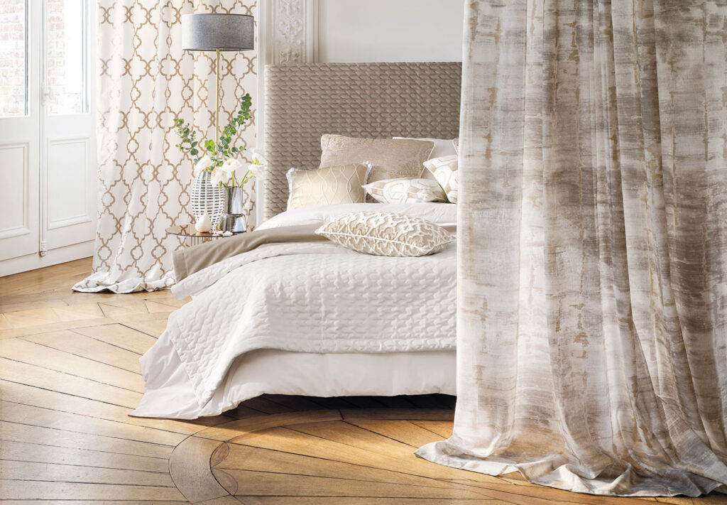
Off-white is even more flexible within the world of interior design as it includes both ends of the spectrum from slightly grey whites, through to warmer cream tones.
The best design trends for using off-white
Significant use of off-white is perfect for a Scandi inspired space. In Scandi design, it’s all about using natural colours from sage greens to stone greys and by using plenty of off-white on the walls, you can be more confident with coloured window furnishings, furniture, and fixtures.
While Scandi may be synonymous with uncomplicated design, off-white will also work with more eclectic trends. Take Cottagecore for example, blocks of off-white will free up the rest of your design to be filled with gingham checks and floral prints!
While you may think pure white is the only choice for chic, classic monochrome spaces, off-white can also work! In recent months, there has been a reimagination of monochrome design where black gives way to navy blue or anthracite, and the white counterpart is replaced with creamier shades. It’s certainly a trend worth exploring!
How to use off-white
Off-white is a catch all term for a range of exciting, chic, and sophisticated colours. Some can be warming, some can be cool and calming, but all are on trend and glamourous!
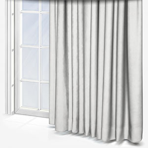
Unlike pure white, off-white colours aren’t overly clinical. Pure white is an excellent colour for use in interior design, but it has a formality to it that can restrict its utility. Off-white in reply can enrich a wide range of popular design trends.
That said there are a few top tips for using off-white in interior design which depends on the colours you’re looking to use alongside it.
Colours that go with off-white
If you’re using warming colours – for example yellows, oranges, reds, and browns – the best off-white colour to help enrich them will be the cosier tones. Shades closer to cream and oatmeal will retain the majesty of white but won’t detract from the richness of the spot colours. Let’s say you wanted to use mustard yellow in a space as a spot colour, fitting yellow Roman blinds with matching yellow cushions set amidst a warm cream wall colour would make the room feel cosy, calming, and comfortable.
For cooler colours – including pale greens and blues – the grey end of the off-white colour spectrum is where you should focus your attentions. The colder tones of off-white will contrast subtly with the spot colours, helping them to pop! If you have pale green walls, a grey off-white curtain or roller blind will help to break up the space without it feeling forced or obvious. Likewise, off-white furniture such as a comfy sofa or chairs will also add to the effect. Where possible, if you’re making strong use of soft primary colours, try to keep the off-white furnishings in a similar shade. This can be tricky but it’s certainly worth the effort.
Grey isn’t dead, but its role is changing. Consider using off-white as the dominant colour in your space and let other colours – even including grey – be the supporting spot colours. If you’re not 100% sure of which colours to use in your home, you can order up to eight free samples to see your options in the flesh!
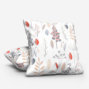
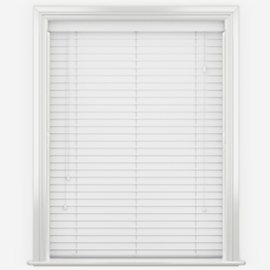
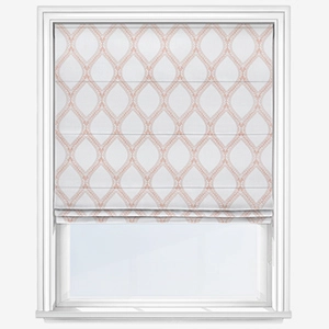
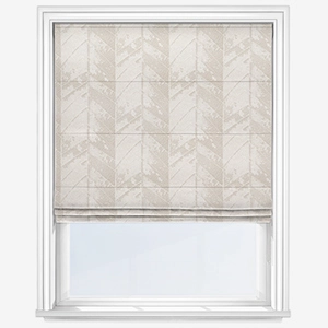
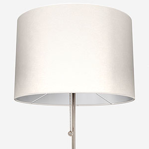
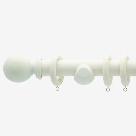
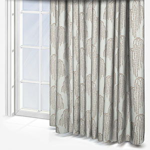
Shop some of our favourite products for off-white interiors:
Share this post
Other posts you may be interested in
Textured Nudes: A Touch Of Stylish Serenity
By Ash Walker
Colour Focus: Warm Metals
By Ana Zuravliova
Textured Nudes: A Touch Of Stylish Serenity